In this post, I use Agile Methodology to collect requirements and write user stories for my iTunes dashboard.
Table of Contents
- Introduction
- Data Dictionary
- Beginning The Design Process
- Introducing Agile
- My Persona
- My Epic And User Stories
- Summary
Introduction
In my recent posts, I’ve been building a basic data pipeline for an iTunes export file. So far I have:
- Built a Python ETL that extracts iTunes export data into a Pandas DataFrame and transforms some columns.
- Saved the transformed data to Amazon S3 as a Parquet file.
- Ingested the data into an Amazon Athena table.
- Established a secure connection between Athena and Microsoft Power BI using Simba Athena.
Now I can think about analysing this data. I’m building a dashboard for this as they offer advantages including:
- Dashboards communicate information quickly without having to run reports or write queries.
- It is easy to sort and filter dashboards.
- Using dashboard visuals doesn’t require knowledge of the maths and scripting behind them.
- Dashboard visuals can interact with each other and respond to changes and selections.
Before I start thinking about my dashboard I should review the data. My preferred way of doing this is to create a data dictionary, so let’s start there.
Data Dictionary
In this section, I will explain what a data dictionary is and create one for the iTunes data in my Athena table.
Data Dictionary Introduction
A data dictionary is data about data. Just like a dictionary contains information on and definitions of words, IBM’s Dictionary of Computing defines a data dictionary as:
“a centralized repository of information about data such as meaning, relationships to other data, origin, usage, and format”
IBM Dictionary of Computing
Typical attributes of data dictionaries include:
- Data type
- Description
- Conditions: Is the data required? Does it have dependencies?
- Default value
- Minimum and maximum values
There are numerous online resources about data dictionaries. I like this video as a gentle introduction to the topic using real-world examples:
Now let’s apply this to my iTunes data.
iTunes Data Dictionary
Here, I have written a short data dictionary to give my data some context. I have divided the dictionary into data types and given a brief description of each field.
Some fields have two field names because they will be renamed on the dashboard:
albumwill becomekeyas iTunes has no field for musical keys, so I usealbuminstead.namewill becometitlefor clarity.tracknumberwill becomebpmas, although iTunes does have a BPM field, this is not included in its export files.
Strings:
album/key: A track’s musical key.artist: A track’s artist(s).genre: A track’s music genre.name/title: A track’s title and mix.
Integers:
myrating: A track’s rating in iTunes. Min 0 Max 100 Interval +20.myratingint: A track’s rating as an integer. Min 0 Max 5 Interval +1.plays: A track’s total play count.tracknumber/bpm: A track’s tempo in beats per minute.year: A track’s year of release.
DateTimes:
dateadded: The date & time a track was added to iTunes.datemodified: The date & time a track was last modified in iTunes.lastplayed: The date & time a track was last played in iTunes.dateaddeddate: The date a track was added to iTunes.datemodifieddate: The date a track was last modified in iTunes.lastplayeddate: The date a track was last played in iTunes.
For context, this is a typical example of a track’s details in the iTunes GUI:

For completeness, dateadded and datemodified are recorded in the File tab.
Now that the data is defined, I can start thinking about the dashboard. But where do I start?
Beginning The Design Process
In this section, I talk about how I got my dashboard design off the ground.
I didn’t decide to write user stories for my iTunes dashboard straightaway. This post took a few versions to get right, so I wanted to spend some time here running through my learning process.
Learning From The Past
This isn’t the first time I’ve made a dashboard for my own use. However, I have some unused and abandoned dashboards that usually have at least one of these problems:
- They lack clarity and/or vision, resulting in a confusing user experience.
- The use of excessive tabs causes a navigational nightmare.
- Visuals are either poorly or incorrectly chosen.
- Tables include excessive amounts of data. Even with conditional formatting, insights are hard to find.
When I started designing my iTunes dashboard, I was keen to make something that would be useful and stand the test of time. Having read Information Dashboard Design by Stephen Few, it turns out the problems above are common in dashboard design.
In his book, Stephen gives guidance on design considerations and critiques of sample dashboards that are just as useful now as they were when the book was published in 2006.
So I was now more clued up on design techniques. But that’s only half of what I needed…
What About The User?
I searched online for dashboard design tips while waiting for the book to arrive. While I did get useful results, they didn’t help me answer questions like:
- How do I identify a dashboard’s purpose and requirements?
- How do I justify my design choices?
- What do I measure to confirm that the dashboard adds value?
I was ultimately pointed in the direction of Agile Analytics: A Value-Driven Approach to Business Intelligence and Data Warehousing by Dr Ken Collier. In this book, Ken draws on his professional experience to link the worlds of Business Intelligence and Agile Methodology, including sections on project management, collaboration and user stories.
(I should point out that I’ve only read Chapters 1: Agile Analytics: Management Methods and Chapter 4: User Stories for BI Systems currently, but I’m working on it!)
Wait! I’ve used Agile before! Writing user stories for my iTunes dashboard sounds like a great idea!
So let’s talk about Agile.
Introducing Agile
In this section, I will introduce some Agile concepts and share resources that helped me understand the theory behind them.
Agile Methodology
Agile is a software development methodology focusing on building and delivering software in incremental and iterative steps. The 2001 Manifesto for Agile Software Development declares the core Agile values as:
- Individuals and interactions over processes and tools.
- Working software over comprehensive documentation.
- Customer collaboration over contract negotiation.
- Responding to change over following a plan.
Online Agile resources are plentiful. Organisations like Atlassian and Wrike have produced extensive Agile resources that are great for beginners and can coach the more experienced.
For simpler introductions, I like Agile In A Nutshell and this Development That Pays video:
Epics
Kanbanize defines Epics as:
“…large pieces of work that can be broken down into smaller and more manageable work items, tasks, or user stories.”
“What Are Epics in Agile? Definition, Examples, and Tracking” by Kanbanize
I found the following Epic resources helpful:
- Firstly, Wrike’s Complete Guide to Agile Epics is great for newcomers, with good examples of epics and explanations of how epics link to other elements like user stories and personas.
- Secondly, Atlassian’s article about Epics goes into considerable detail and introduces topics like estimates and measuring.
- Finally, this Dejan Majkic video explains Epics at a high level:
User Stories
Digité defines a User Story as:
“…a short, informal, plain language description of what a user wants to do within a software product to gain something they find valuable.”
“User Stories: What They Are and Why and How to Use Them” by Digité
I found the following User Story resources helpful:
- Firstly, Atlassian’s article about User Stories explains the theory behind them, introducing User Stores as part of a wider Agile Project Management section.
- Secondly, Wrike’s guide on How to Create User Stories offers practical advice including five steps for writing user stories and an introduction to the INVENT acronym.
- This femke.design video gives a great personable introduction to User Stories:
- Finally, this Atlassian video assumes some knowledge of User Stories and has more of a training feel:
Personas
Wrike defines Personas as:
“…fictional characteristics of the people that are most likely to buy your product. Personas provide a detailed summary of your ideal customer including demographic traits such as location, age, job title as well as psychographic traits such as behaviors, feelings, needs, and challenges.”
“What Are Agile Personas?” by Wrike
- The full Wrike Agile Personas article expands on this definition and offers guidance on getting started with personas.
- This Atlassian video gives additional tips and advice on creating personas:
That’s all the theory for now! Let’s begin writing the user stories I’m going to use for my iTunes dashboard, starting by creating a persona.
My Persona
In this section, I will create the persona I’ll use to write the epic and user stories for my iTunes dashboard. But why bother?
Why Create A Persona?
Some sources consider personas to be optional while others prioritise them highly. I’m using one here for a few reasons:
- Firstly, I’m my own customer here. Using a persona will make it easier to identify my requirements, and ringfence ‘engineer me’ from ‘user me’.
- Secondly, the persona will help to focus the project. Once the persona’s goals have been defined, they will present a clear target to work towards.
- Finally, creating a persona makes this post far easier to write! Pulling my requirements out of thin air doesn’t feel authentic, and writing about myself in the third person is WEIRD.
So who is this persona?
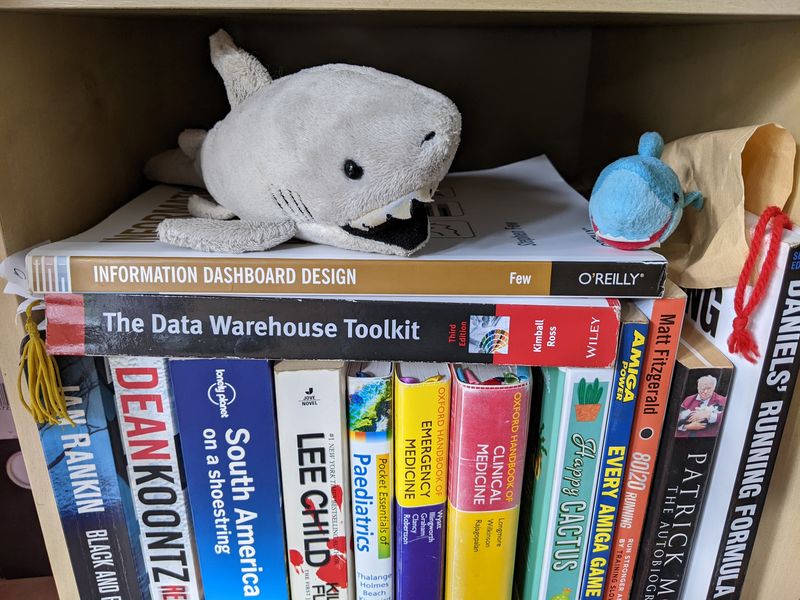
Introducing Biscuit
Meet my stakeholder, Biscuit:

Being Biscuit
Biscuit is a sassy, opinionated shark that will tell anyone who listens about when he met Frank Sidebottom.
Biscuit likes listening to dance music. He has a collection of around 3500 tracks and uses iTunes smart playlists to listen to them. His collection ranges from Deep House at around 115 BPM to Drum & Bass at around 180 BPM.
Biscuit is a bit of a music geek. He found out about music theory when he saw key notations on his Anjunabeats record sleeves and wondered what they meant. He uses Mixed In Key to scan his collection, so each track has rich metadata.
Biscuit has various playlists depending on his mood, location and/or activity. He likes to choose between recent favourites and tunes he’s not heard for a while.
Biscuit doesn’t use music streaming services and doesn’t want to due to the internet requirement and the bitrates offered.
Biscuit’s Challenges
The current process of creating new smart playlists involves spending time looking through existing playlists and using trial and error. This usually takes at least an hour and doesn’t guarantee good results.
As the current process of generating new playlists is undesirable, existing and legacy playlists are being used more often. This is creating problems:
- Tracks in those playlists get disproportionate plays and become stale, while tracks not in those playlists don’t get played for ages.
- Underused playlists consume iTunes compute resources and iPhone storage space.
- Time and money are being spent on adding new tracks to the collection as no simple process exists to identify lesser played tracks.
Biscuit’s Goals
Biscuit wants a quicker way to use his iTunes data for building smart playlists. Specifically, he wants to know about the tracks he plays most and least often so that future smart playlists can be focused accordingly.
Biscuit would like to visualise his iTunes data in a dashboard. The dashboard should show:
- If any listening trends or behaviours exist.
- Traits of disproportionately overplayed and underplayed tracks.
Biscuit also wants to know if the following factors influence how many times a track is played:
- BPM: Is there a relationship between a track’s tempo and its play count?
- Date Added: Recently added tracks will usually have fewer plays, but what about tracks that have been in the collection longer? Do tracks exist with older
dateaddeddates and low play counts?
- Rating: The assumption would be that tracks with higher ratings will get played more. Is this correct?
- Year: Are tunes produced in certain years played more than others? Are there periods of time that future smart playlists should target?
My Epic And User Stories
In this section, I will write the epic and user stories that I will use to design and create my iTunes dashboard.
Designing a dashboard would usually be a user story in an epic – I’ve allocated a user story to each dashboard visual to help keep me focused, as time is currently tight and it can be challenging to time for this!
Epic: iTunes Play Counts Dashboard
As a playlist builder, Biscuit wants to use a dashboard to analyse the play counts in his iTunes data so that he can simplify the process of creating new smart playlists.
ACCEPTANCE CRITERIA:
- Biscuit can analyse play totals and see how they are distributed between
bpm,dateadded,ratingandyearfields. - Biscuit can use the dashboard for architecting new smart playlists instead of iTunes.
- Biscuit can access the dashboard on PC and mobile.
- The dashboard’s operational costs must be minimal.
User Story: Plays Visual
As a playlist builder, Biscuit wants to see play totals so that it is easier to review and manage his current play intervals.
ACCEPTANCE CRITERIA:
- Biscuit can see and sort totals of individual plays.
- Biscuit can see and sort totals of current play intervals.
- The dashboard can be filtered by plays and current play intervals.
- The dashboard must use the following play intervals:
- P0: unplayed.
- P01-P05: between 1 and 5 plays.
- P06-P10: between 6 and 10 plays.
- P11-P20: between 11 and 20 plays.
- P21-P30: between 21 and 30 plays.
- P31+: over 30 plays.
User Story: BPMs Visual
As a playlist builder, Biscuit wants to see how plays are distributed between track BPMs so that he can identify how BPMs influence which tracks are played most and least often.
ACCEPTANCE CRITERIA:
- Biscuit can see relationships between BPMs and play totals at a high level.
- Biscuit can both filter the visual and drill down for added precision.
- The dashboard can be filtered by both BPMs and current BPM intervals.
- The dashboard must use the following BPM intervals:
- B000-B126: 126 BPM and under.
- B127-B129: 127 BPM to 129 BPM.
- B130-B133: 130 BPM to 133 BPM.
- B134-B137: 134 BPM to 137 BPM.
- B138-B140: 138 BPM to 140 BPM.
- B141-B150: 141 BPM to 150 BPM.
- B151+: 151 BPM and over.
User Story: Ratings Visual
As a playlist builder, Biscuit wants to see how plays are distributed between iTunes ratings so that he can identify how ratings influence which tracks are played most and least often.
ACCEPTANCE CRITERIA:
- Biscuit can see relationships between ratings and play totals at a high level.
- Biscuit can both filter the visual and drill down for added precision.
- The dashboard can be filtered by rating.
User Story: Date Added Visual
As a playlist builder, Biscuit wants to see how plays are distributed relative to when tracks were added to the collection so that he can identify tracks with abnormally high and low play totals relative to how long they have been in the collection.
ACCEPTANCE CRITERIA:
- Biscuit can see relationships between the year tracks were added to the collection and play totals at a high level.
- Biscuit can both filter the visual and drill down for added precision.
- The dashboard can be filtered by the years that tracks were added in.
User Story: Year Visual
As a playlist builder, Biscuit wants to see how plays are distributed relative to track production years so that he can identify how production years influence which tracks are played most and least often.
ACCEPTANCE CRITERIA:
- Biscuit can see relationships between production years and play totals at a high level.
- Biscuit can both filter the visual and drill down for added precision.
- The dashboard can be filtered by production year.
Summary
In this post, I used Agile Methodology to collect requirements and wrote user stories for my iTunes dashboard.
I created a data dictionary to give context to my iTunes data, examined some high-level Agile concepts and used a persona to write five user stories that I will use to create my iTunes dashboard.
If this post has been useful, please feel free to follow me on the following platforms for future updates:
Thanks for reading ~~^~~