Hopefully like many people in tech, I have a collection of articles, repos, projects and whatnot saved under the banner of “That sounds cool / looks interesting / feels useful – I should check that out at some point.” Sometimes things even come off that list…
DuckDB was on my list, and went to the top when I heard about Tobias Müller’s free SQL Workbench tool powered by DuckDB-Wasm. What I heard was very impressive and pushed me to finally examine DuckDB up close.
So what is DuckDB?
About DuckDB
This section examines DuckDB and DuckDB-Wasm – core components of SQL Workbench.
DuckDB
DuckDB is an open-source SQL Online Analytical Processing (OLAP) database management system. It is intended for analytical workloads, and common use cases include in-process analytics, exploration of large datasets and machine learning model prototyping. DuckDB was released in 2019 and reached v1.0.0 on June 03 2024.
DuckDB is an embedded database that runs within a host process. It is lightweight, portable and requires no separate server. It can be embedded into applications, scripts, and notebooks without bespoke infrastructure.
DuckDB uses a columnar storage format and supports standard SQL features like complex queries, joins, aggregations and window functions. It can be used with programming languages like Python and R.
In this Python example, DuckDB:
Creates an in-memory database
Defines a users table.
Inserts data into users.
Runs a query to fetch results.
Python
import duckdb# Create a new DuckDB database in memorycon = duckdb.connect(database=':memory:')# Create a table and insert some datacon.execute("""CREATE TABLE users ( user_id INTEGER, user_name VARCHAR, age INTEGER);""")con.execute("INSERT INTO users VALUES (1, 'Alice', 30), (2, 'Bob', 25), (3, 'Charlie', 35)")# Run a queryresults = con.execute("SELECT * FROM users WHERE age > 25").fetchall()print(results)
DuckDB-Wasm
Launched in 2021, DuckDB WebAssembly (Wasm) is a version of the DuckDB database that has been compiled to run in WebAssembly. This lets DuckDB run in web browser processes and other environments with WebAssembly support.
So what’s WebAssembly? Don’t worry – I didn’t know either and so deferred to an expert:
Since all data processing happens in the browser, DuckDB-Wasm brings new benefits to DuckDB. In-browser dashboards and data analysis tools with DuckDB-Wasm enabled can operate without any server-side processing, improving their speed and security. If data is being sent somewhere then DuckDB-Wasm can handle ETL operations first, reducing both processing time and cost.
Running in-browser SQL queries also removes the need for setting up database servers and IDEs, reducing patching and maintenance (but don’t forget about the browser!) while increasing availability and convenience for remote work and educational purposes.
This section examines SQL Workbench and tries out some of its core features.
About SQL Workbench
Tobias Müller produced SQL Workbench in January 2024. He integrated DuckDB-Wasm into an AWS serverless static site and built an online interactive tool for querying data, showing results and generating visualizations.
SQL Workbench is available at sql-workbench.com. Note that it doesn’t currently support mobile browsers. Tobias has also written a great tutorial post that includes:
and loads more content in addition that I won’t reproduce here. So go and give Tobias some traffic!
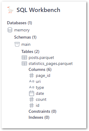
Layout
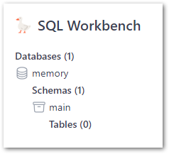
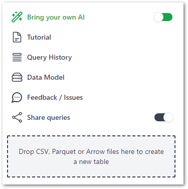
The core SQL Workbench components are:
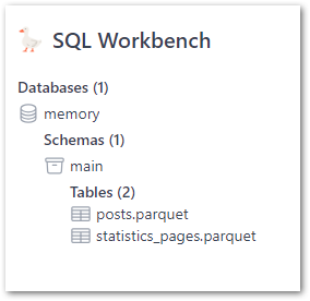
The Object Explorer section shows databases, schema and tables:
The Tools section shows links, settings and a drag-and-drop section for adding files (more on that later):
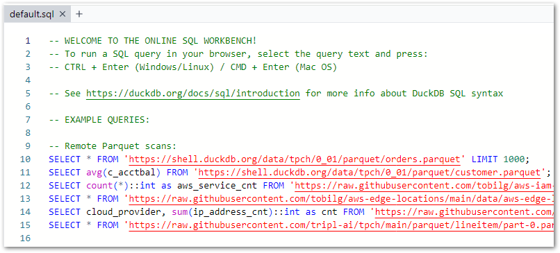
The Query Pane for writing SQL, which preloads with the below script upon each browser refresh:
And finally, the Results Pane shows query results and visuals:
Next, let’s try it out!
Sample Queries
SQL Workbench opens with a pre-loaded script that features:
Instructions:
SQL
-- WELCOME TO THE ONLINE SQL WORKBENCH!-- To run a SQL query in your browser, select the query text and press:-- CTRL + Enter (Windows/Linux) / CMD + Enter (Mac OS)-- See https://duckdb.org/docs/sql/introduction for more info about DuckDB SQL syntax
These queries are designed to show SQL Workbench’s capabilities and the style of SQL queries it can run (expanded on further here). They can also be used for experimentation, so here goes!
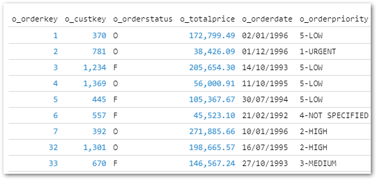
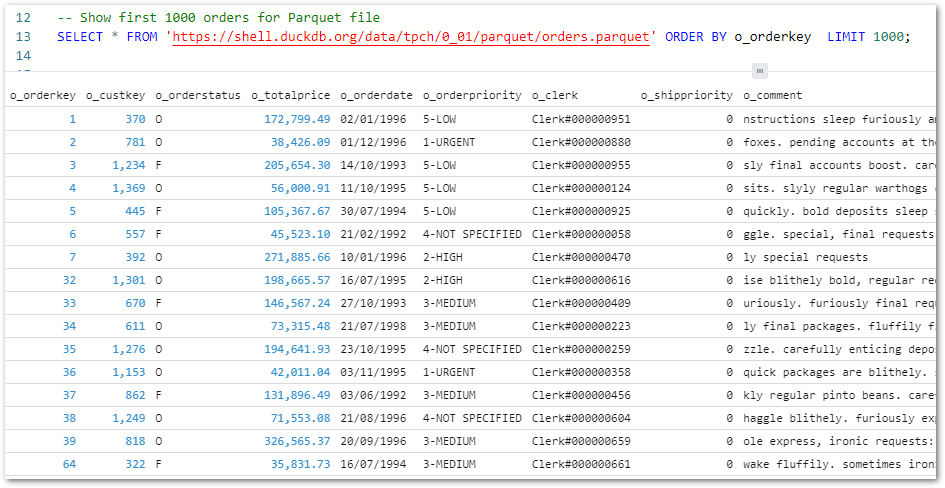
Firstly, I’ve added an ORDER BY to the first Parquet query to make sure the first 1000 orders are returned:
SQL
-- Show first 1000 orders for Parquet fileSELECT*FROM'https://shell.duckdb.org/data/tpch/0_01/parquet/orders.parquet'ORDER BY o_orderkeyLIMIT1000;
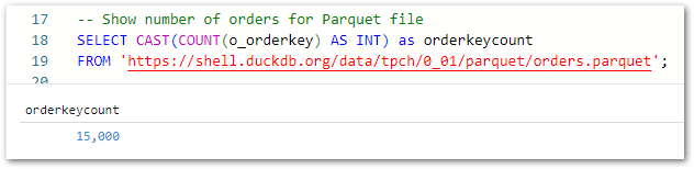
Secondly, I’ve used the COUNT and CAST functions to count the total orders and return the value as an integer:
SQL
-- Show number of orders for Parquet fileSELECTCAST(COUNT(o_orderkey) ASINT) AS orderkeycount FROM'https://shell.duckdb.org/data/tpch/0_01/parquet/orders.parquet';
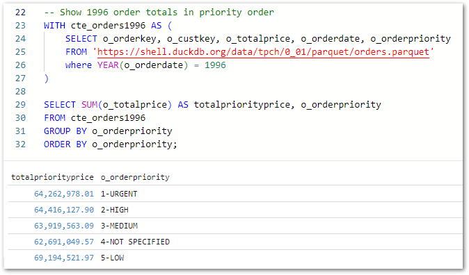
Finally, this query captures all 1996 orders in a CTE and uses it to calculate the 1996 order price totals grouped by order priority:
SQL
-- Show 1996 order totals in priority orderWITH cte_orders1996 AS (SELECT o_orderkey, o_custkey, o_totalprice, o_orderdate, o_orderpriorityFROM'https://shell.duckdb.org/data/tpch/0_01/parquet/orders.parquet'WHEREYEAR(o_orderdate) =1996)SELECTSUM(o_totalprice) AS totalpriorityprice, o_orderpriority FROM cte_orders1996 GROUP BY o_orderpriority ORDER BY o_orderpriority;
After dragging each file onto the assigned section they quickly appear as new tables:
These tables show column names and inferred data types when expanded:
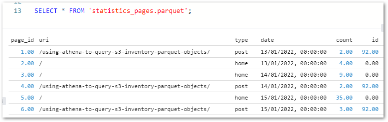
Queries can be written manually or by right-clicking the tables in the Object Explorer. A statistics_pagesSELECT * test query shows the expected results:
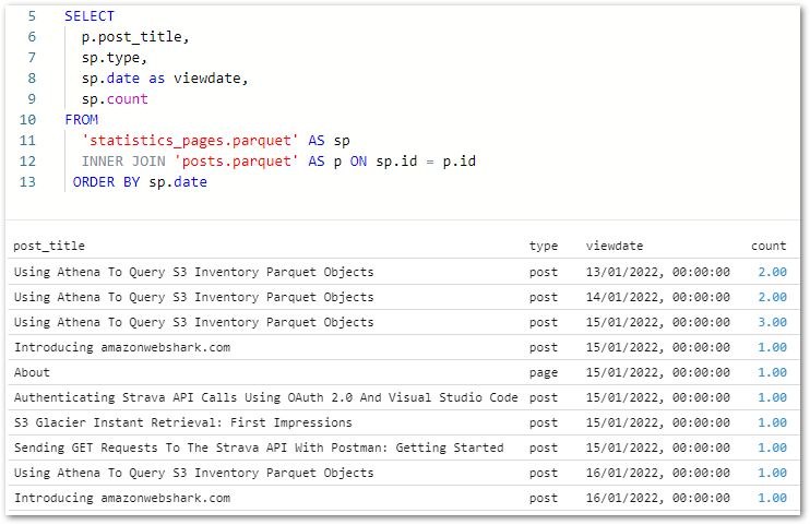
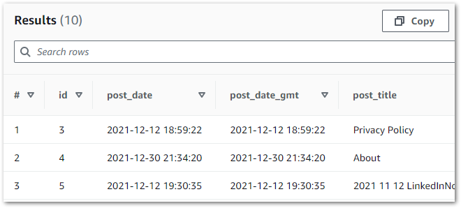
As posts.parquet‘s ID primary key column matches statistics_pages.parquet‘s ID foreign key column, the two files can be joined on this column using an INNER JOIN:
SQL
SELECTp.post_title,sp.type, sp.dateas viewdate,sp.countFROM'statistics_pages.parquet'AS spINNER JOIN'posts.parquet'AS p ONsp.id=p.idORDER BYsp.date
I can use this query to start making visuals!
Visuals
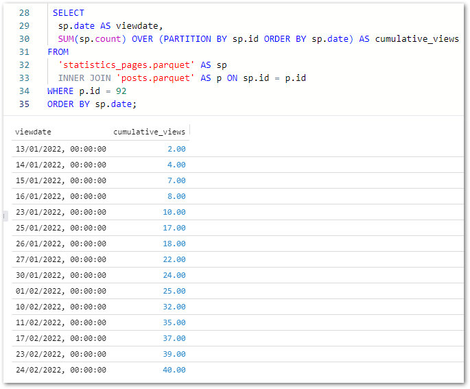
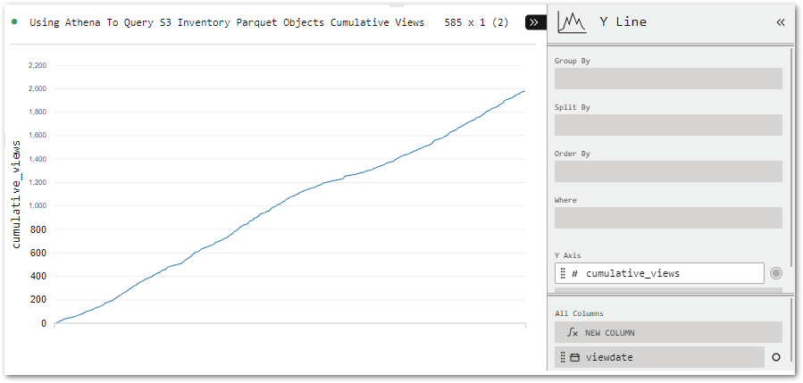
Next, let’s examine SQL Workbench’s visualisation capabilities. To help things along, I’ve written a new query showing the cumulative view count for my Using Athena To Query S3 Inventory Parquet Objects post (ID 92):
SQL
SELECTsp.dateAS viewdate,SUM(sp.count) OVER (PARTITIONBYsp.idORDER BYsp.date) AS cumulative_viewsFROM'statistics_pages.parquet'AS spINNER JOIN'posts.parquet'AS p ONsp.id=p.idWHEREp.id=92ORDER BYsp.date;
(On reflection the join wasn’t necessary for this output, but anyway… – Ed)
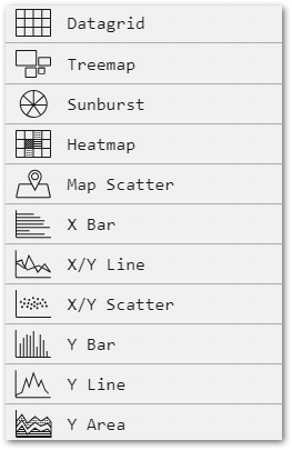
Tobias has written visualisation instructions here so I’ll focus more on how my visual turns out. After the query finishes running, several visual types can be selected:
All I need to do is move viewdata (bottom right) to the Group By bin (top right) to add dates to the X-axis.
Exports & Cleanup
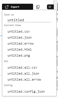
Finally, let’s examine SQL Workbench’s export options. And there’s plenty to choose from!
The CSV and JSON options export the query results in their respective formats. The Arrow option exports query results in Apache Arrow format, which is designed for high-speed in-memory data processing and so compliments DuckDB very well. Dremio wrote a great Arrow technical guide for those curious.
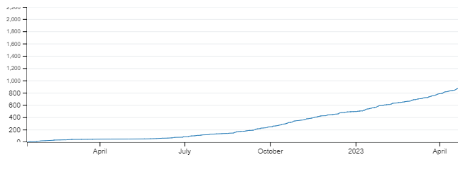
The HTML option produces an interactive graph with tooltips and configuration options. Handy for sharing and I’m sure there’ll be a way to use the backend code for embedding if I take a closer look. The PNG has me covered in the meantime, immediately producing this image:
(Image cropped for visibility – Ed)
Finally there’s the Config.JSON option, which exports the visual’s settings for version control and reproducibility:
All done! So how do I remove my data from SQL Workbench? I…refresh the site! Because SQL Workbench uses DuckDB, my data has only ever been stored locally and in memory. This means the data only persists until the SQL Workbench page is closed or reloaded.
Summary
In this post, I tried Tobias Müller’s free SQL Workbench tool powered by DuckDB-Wasm.
SQL Workbench and DuckDB are both very impressive! The results they produce with no servers or data movement are remarkable, and their tooling greatly simplifies working with modern data formats.
DuckDB makes lots of sense as an AWS Lambda layer, and DuckDB-Wasm simplifies in-browser analytics at a time when being data-driven and latency-averse are constantly gaining importance. I don’t feel like I’ve even scratched the surface of SQL Workbench either, so go and check it out!
Phew – no duck puns. No one has time for that quack. If this post has been useful then the button below has links for contact, socials, projects and sessions:
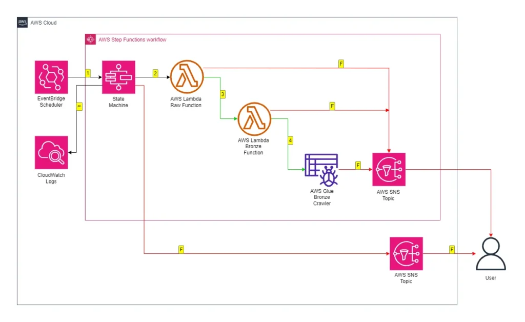
The data_wordpressapi_raw function gets data from the WordPress API and stores it as CSV objects in Amazon S3. The data_wordpressapi_bronze function transforms these objects to Parquet and stores them in a separate bucket. If either function fails, AWS SNS publishes an alert.
While this process works fine, the extracted data is not currently utilized. To derive value from this data, I need to consider transforming it. Several options are available, such as:
Here, I’ve chosen to use AWS Glue. As a fully managed ETL service, Glue automates various data processes in a low-code environment. I’ve not written much about it, so it’s time that changed!
Firstly, I’ll examine AWS Glue and some of its concepts. Next, I’ll create some Glue resources that interact with my WordPress S3 objects. Finally, I’ll integrate those resources into my existing Step Function workflow and examine their costs.
Let’s begin with some information about AWS Glue.
AWS Glue Concepts
This section explores AWS Glue and some of its data discovering features.
AWS Glue
From the AWS Glue User Guide:
AWS Glue is a serverless data integration service that makes it easy for analytics users to discover, prepare, move, and integrate data from multiple sources. You can use it for analytics, machine learning, and application development. It also includes additional productivity and data ops tooling for authoring, running jobs, and implementing business workflows.
An AWS Glue Data Catalog is a managed repository serving as a central hub for storing metadata about data assets. It includes table and job definitions, and other control information for managing an AWS Glue environment. Each AWS account has a dedicated AWS Glue Data Catalog for each region.
The Data Catalog stores information as metadata tables, with each table representing a specific data store and its schema. Glue tables can serve as sources or targets in job definitions. Tables are organized into databases, which are logically grouped collections of related table definitions.
Each table contains column names, data type definitions, partition information, and other metadata about a base dataset. Data Catalog tables can be populated either manually or using Glue Crawlers.
Glue Crawler
A Glue Crawler connects to a data store, analyzes and determines its schema, and then creates metadata tables in the AWS Glue Data Catalog. They can run on-demand, be automated by services like Amazon EventBridge Scheduler and AWS Step Functions, and be started by AWS Glue Triggers.
An activated Glue Crawler performs the following processes on the chosen data store:
Firstly, data within the store is classified to determine its format, schema and properties.
Secondly, data is grouped into tables or partitions.
Finally, the Glue Data Catalog is updated. Glue creates, updates and deletes tables and partitions, and then writes the metadata to the Data Catalog accordingly.
Now let’s create a Glue Crawler!
Creating A Glue Crawler
In this section, I use the AWS Glue console to create and run a Glue Crawler for discovering my WordPress data.
Crawler Properties & Sources
There are four steps to creating a Glue Crawler. Step One involves setting the crawler’s properties. Each crawler needs a name and can have optional descriptions and tags. This crawler’s name is wordpress_bronze.
Step Two sets the crawler’s data sources, which is greatly influenced by whether the data is already mapped in Glue. If it is then the desired Glue Data Catalog tables must be selected. Since my WordPress data isn’t mapped yet, I need to add the data sources instead.
My Step Function workflow puts the data in S3, so I select S3 as my data source and supply the path of my bronze S3 bucket’s wordpress_api folder. The crawler will process all folders and files contained in this S3 path.
Finally, I need to configure the crawler’s behaviour for subsequent runs. I keep the default setting, which re-crawls all folders with each run. Other options include crawling only folders added since the last crawl or using S3 Events to control which folders to crawl.
Classifiers are also set here but are out of scope for this post.
Crawler Security & Targets
Step Three configures security settings. While most of these are optional, the crawler needs an IAM role to interact with other AWS services. This role consists of two IAM policies:
A customer-managed policy with s3:GetObject and s3:PutObject actions allowed on the S3 path given in Step Two.
This role can be chosen from existing roles or created with the crawler.
Step Four begins with setting the crawler’s output. The Crawler creates new tables, requiring the selection of a target database for these tables. This database can be pre-existing or created with the crawler.
An optional table name prefix can also be set, which enables easy table identification. I create a wordpress_api database in the Glue Data Catalog, and set a bronze- prefix for the new tables.
The Crawler’s schedule is also set here. The default is On Demand, which I keep as my Step Function workflow will start this crawler. Besides this, there are choices for Hourly, Daily, Weekly, Monthly or Custom cron expressions.
Advanced options including how the crawler should handle detected schema changes and deleted objects in the data store are also available in Step Four, although I’m not using those here.
And with that, my crawler is ready to try out!
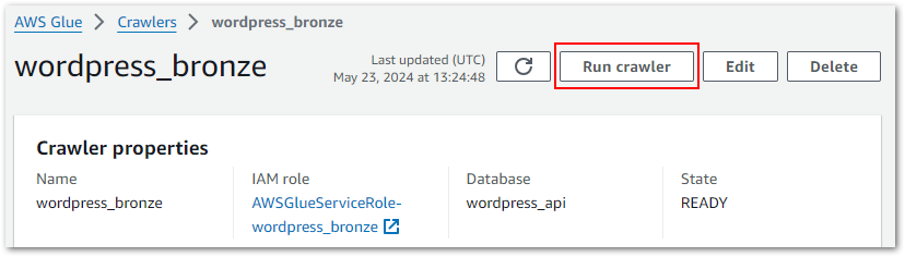
Running The Crawler
My crawler can be tested by accessing it in the Glue console and selecting Run Crawler:
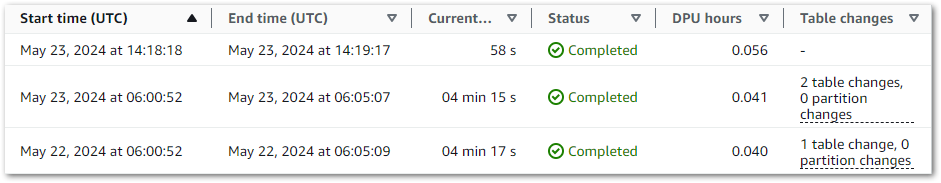
The crawler’s properties include run history. Each row corresponds to a crawler execution, recording data including:
AWS stores the logs in an aws-glue/crawlersCloudWatch Log Group, in which each crawler has a dedicated log stream. Logs include messages like the crawler’s configuration settings at execution:
Crawler configured with Configuration
{
    "Version": 1,
    "CreatePartitionIndex": true
}
 and SchemaChangePolicy
{
    "UpdateBehavior": "UPDATE_IN_DATABASE",
    "DeleteBehavior": "DEPRECATE_IN_DATABASE"
}
And details of what was changed and where:
Table bronze-statistics_pages in database wordpress_api has been updated with new schema
Checking The Data Catalog
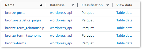
So what impact has this had on the Data Catalog? Accessing it and selecting the wordpress_api database now shows five tables, each matching S3 objects created by the Step Functions workflow:
Data can be viewed by selecting Table Data on the desired row. This action executes an Athena query, triggering a message about the cost implications:
You will be taken to Athena to preview data, and you will be charged separately for Athena queries.
If accepted, Athena generates and executes a SQL query in a new tab. In this example, the first ten rows have been selected from the wordpress_api database’s bronze-posts table:
When this query is executed, Athena checks the Glue Data Catalog for the bronze-posts table in the wordpress_api database. The Data Catalog provides the S3 location for the data, which Athena reads and displays successfully:
Now that the crawler works, I’ll integrate it into my Step Function workflow.
Crawler Integration & Costs
In this section, I integrate my Glue Crawler into my existing Step Function workflow and examine its costs.
Architectural Diagrams
Let’s start with some diagrams. This is how the crawler will behave:
While updating the crawler’s wordpress_bronze CloudWatch Log Stream throughout:
The wordpress_bronze Glue Crawler crawls the bronze S3 bucket’s wordpress-api folder.
The crawler updates the Glue Data Catalog’s wordpress-api database.
This is how the Crawler will fit into my existing Step Functions workflow:
While updating the workflow’s CloudWatch Log Group throughout:
An EventBridge Schedule executes the Step Functions workflow.
Run Succeeds: Update Glue Data Catalog. Workflow ends.
An SNS message is published if the Step Functions workflow fails.
Step Function Integration
Time to build! Let’s begin with the crawler’s requirements:
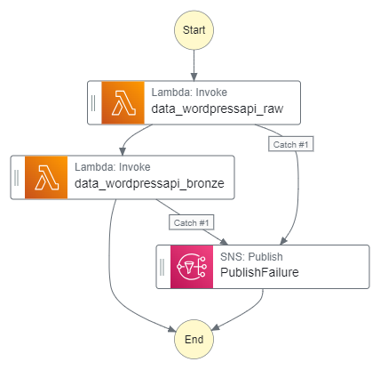
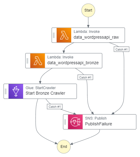
The crawler must only run after both Lambda functions.
It must also only run if both functions invoke successfully first.
If the crawler fails it must alert via the existing PublishFailure SNS topic.
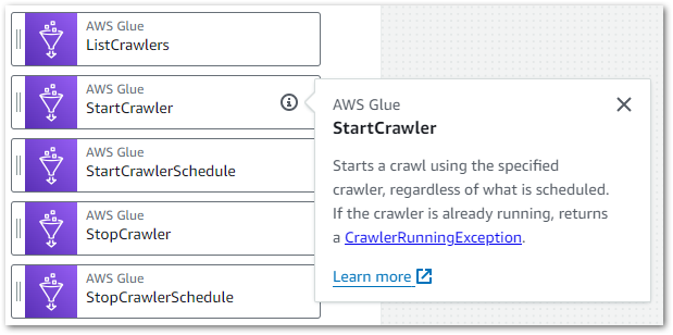
This requires adding an AWS Glue: StartCrawler action to the workflow after the second AWS Lambda: Invoke action:
This action differs from the ones I’ve used so far. The existing actions all use optimized integrations that provide special Step Functions workflow functionality.
Conversely, StartCrawler uses an SDK service integration. These integrations behave like a standard AWS SDK API call, enabling more fine-grained control and flexibility than optimised integrations at the cost of needing more configuration and management.
Here, the Step Functions StartCrawler action calls the Glue API StartCrawler action. After adding it to my workflow, I update the action’s API parameters with the desired crawler’s name:
JSON
{"Name": "wordpress_bronze"}
Next, I update the action’s error handling to catch all errors and pass them to the PublishFailure task. These actions produce these additions to the workflow’s ASL code:
Additionally, the fully updated Step Functions workflow ASL script can be viewed on my GitHub.
Finally, I need to update the Step Function workflow IAM role’s policy so that it can start the crawler. This involves allowing the glue:StartCrawler action on the crawler’s ARN:
My Step Functions workflow is now orchestrating the Glue Crawler, which will only run once both Lambda functions are successfully invoked. If either function fails, the SNS topic is published and the crawler does not run. If the crawler fails, the SNS topic is published. Otherwise, if everything runs successfully, the crawler updates the Data Catalog as needed.
So how much does discovering data with AWS Glue cost?
Glue Costs
This is from AWS Glue’s pricing page for crawlers:
There is an hourly rate for AWS Glue crawler runtime to discover data and populate the AWS Glue Data Catalog. You are charged an hourly rate based on the number of Data Processing Units (or DPUs) used to run your crawler. A single DPU provides 4 vCPU and 16 GB of memory. You are billed in increments of 1 second, rounded up to the nearest second, with a 10-minute minimum duration for each crawl.
$0.44 per DPU-Hour, billed per second, with a 10-minute minimum per crawler run
With the AWS Glue Data Catalog, you can store up to a million objects for free. If you store more than a million objects, you will be charged $1.00 per 100,000 objects over a million, per month. An object in the Data Catalog is a table, table version, partition, partition indexes, statistics or database.
The first million access requests to the Data Catalog per month are free. If you exceed a million requests in a month, you will be charged $1.00 per million requests over the first million. Some of the common requests are CreateTable, CreatePartition, GetTable , GetPartitions, and GetColumnStatisticsForTable.
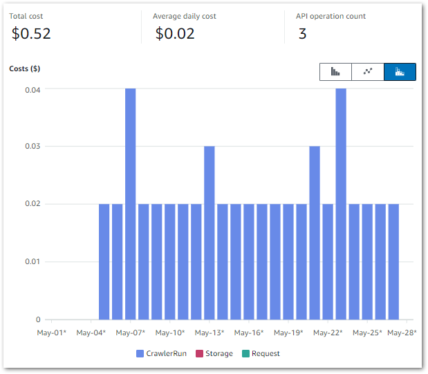
So how does this relate to my workflow? The below Cost Explorer chart shows my AWS Glue API costs from 01 May to 28 May. Only the CrawlerRun API operation has generated charges, with a daily average of $0.02:
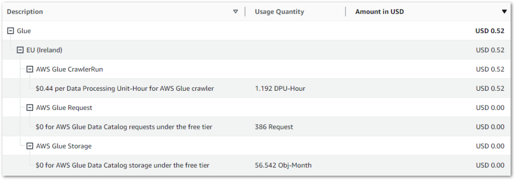
My May 2024 AWS bill shows further details on the requests and storage items. The Glue Data Catalog’s free tier covers my usage:
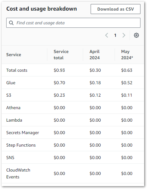
Finally, let’s review the entire pipeline’s costs for April and May. Besides Glue, my only other cost remains S3:
Summary
In this post, I used the data discovering features of AWS Glue to crawl and catalogue my WordPress API pipeline data.
Glue’s native features and integration with other AWS services make it a great fit for my WordPress pipeline’s pending processes. I’ll be using additional Glue features in future posts, and wanted to spotlight the Data Catalog early on as it’ll become increasingly helpful as my use of AWS Glue increases.
If this post has been useful then the button below has links for contact, socials, projects and sessions:
A data pipeline involves many aspects, which future posts will explore. This post focuses on extracting data from my WordPress database and storing it as flat files in AWS.
Firstly, I’ll discuss my architectural decisions for this part of the pipeline. Then I’ll examine the functions in my Python script that interact with AWS and perform data extraction. Finally, I’ll bring everything together and explain how it all works.
Architectural Decisions
In this section, I examine my architectural decisions and outline the pipeline’s processes.
Programming Language
My first decision concerned which programming language to use. I’m using Python here for several reasons:
I use Python at work and am always looking to refine my skills.
Next, I chose what data to extract from my WordPress MySQL database. I’m interested in the following tables, which are explained in greater detail in 2023’s Deep Dive post:
In November I migrated amazonwebshark to Hostinger, whose MySQL remote access policyrequires an IP address. While this isn’t a problem locally, AWS is a different story. I’d either need an EC2 instance with a static IP, or a Lambda function with several networking components. These are time and money costs I’d prefer to avoid, so no calling the database.
Fortunately, WordPress has an API!
WordPress API
The WordPress REST API lets applications interact with WordPress sites by sending and receiving data as JSON objects. Public content like posts and comments are publicly accessible via the API, while private and password-protected content requires authentication.
Custom API for WordPress plugin allows you to create WordPress APIs / custom endpoints / REST APIs. You can Fetch / Modify / Create / Delete data with an easy-to-use graphical interface. You can also build custom APIs by writing custom SQL queries for your WP APIs.
The free plan lets users create as many endpoints as needed. But it also has a pretty vital limitation – API key authentication is only possible on their Premium plan. In the free plan, all endpoints are public!
Now let me be clear – this isn’t necessarily a problem. After all, the WordPress API is public! And my WordPress data doesn’t contain any PII or sensitive data. No – the risk I’m trying to address here isn’t a security one.
Public endpoints can be called by anyone or anything at any time. With WordPress, they have dedicated, optimised resources that auto-scale on demand. Whereas I have one Hostinger server that is doing every site process. Could it be DDoSed into oblivion by tons of API calls from bad actors? Do I want to find out?
As I’m using the plugin’s free tier here, I’ll mitigate my risks by:
Adding random strings to the endpoints to make them less guessable.
Not showing the endpoints in my script or this post.
So ok – how will I get the API endpoints then?
Parameters
Next, I need to decide how my script will get the endpoints to query and the S3 bucket name to store the results.
With previous scripts, I’ve used features like gitignore and dot sourcing to hide parameters I don’t want to expose. While this works, it isn’t ideal. Dot sourcing breaks if the file paths change, and even with gitignore any credentials are still hardcoded into the script locally.
A better approach is to use a process similar to a password manager, where an authenticated user or role can request and receive credentials using secure channels. AWS has two services for this requirement: AWS Secrets Manager and AWS Systems Manager Parameter Store.
Secrets Manager Vs Parameter Store
Secrets Manager is designed for managing and rotating sensitive information like database credentials, API keys, and other types of secrets. Conversely, Parameter Store is designed for storing configuration data, including plaintext or sensitive information, in a hierarchical structure.
I’m using Parameter Store here for two reasons:
My parameters are for configuration, and on their own won’t lead to account or service compromise. Therefore, I don’t need most of Secrets Manager’s features so it’s overkill for this scenario.
Next, I need to decide where to store the API data. And I’m already using AWS for parameters, so I was always going to end up using S3. But what makes S3 an obvious fit here?
Integration: S3 is one of the oldest and most mature AWS services. It is well supported by both the Python SDK and other AWS services like EventBridge, Glue and Athena for processing and analysis.
Scalability: S3 will accept objects from a couple of bytes to terabytes in size (although if I’m generating terabytes of data here something is very wrong!). I can run my script at any time and as often as I want, and S3 will handle all the data it receives.
Cost: S3 won’t be entirely free here because I’ll be creating and accessing lots of data during testing. But even so, I expect it to cost me pence. I’m not keeping versions at this stage either, so my costs will only be for the current objects.
Much has been written about S3 over the years, so I’ll leave it at this.
Use Of Flat Files
Finally, let’s examine the decision to store flat files in the first place. The data is already in a database – why duplicate it?
Decoupling: Putting raw data into S3 at an early stage of the pipeline decouples the database at that point. Databases can become inaccessible, corrupted or restricted. The S3 data would be completely unaffected by these database issues, allowing the pipeline to persist with the available data.
Reduced Server Load: Storing data in S3 means the rest of the pipeline reads the S3 objects instead of the database tables. This reduces the Hostinger server’s load, letting it focus on transactional queries and site processes. S3 is almost serving as a read replica here.
Security: It is simpler for AWS services to access data stored in S3 than the same data stored on Hostinger’s server. AWS services accessing server data require MySQL credentials and a whitelisted IP. In contrast, AWS services accessing S3 data require…an IAM policy.
Architectural Diagram
This is an architectural diagram of the expected process:
User triggers the Python function.
Python interacts with AWS Python SDK.
SDK calls Parameter Store for WordPress & S3 parameters. These are returned to Python via the SDK.
Python calls WordPress API. WordPress API returns data.
Python writes API data to S3 bucket via the SDK.
Setup & Config
I completed some local and cloud configurations before I started writing my Python script to extract WordPress API data. This section explores my laptop setup and AWS infrastructure.
I already have an S3 bucket for ingesting raw data, so that’s sorted. I made a wordpress-api prefix in that bucket to partition the uploaded data.
This bucket doesn’t have versioning enabled because it has a high object turnover. Versioning is unneeded and could get very expensive without a good lifecycle policy! While this would be simple to do, it’s a wasted effort at this point in the pipeline.
Another factor against versioning is that I can recreate S3 objects from the MySQL database. As objects are reproducible, there is no need for the delete protection offered by versioning.
AWS Parameters
I’m using Parameter Store to hold two parameters: my S3 bucket name and my WordPress API endpoints. Each of these uses a different parameter type.
The S3 bucket name is a simple string that uses the String Parameter Type. This is intended for blocks of text up to 4096 characters (4kb). The API endpoints are a collection of strings generated by the WordPress plugin. I use the StringList Parameter Type here, which is intended for comma-separated lists of values. This lets me store all the endpoints in a single parameter, optimising my code and reducing my AWS API calls.
Python Script
In this section, I examine the various parts of my Python script that will extract data from the WordPress API. This includes functions, methods and intended functionality.
Artefacts within this post have been created at a certain point in my learning journey. They do not represent best practices, may be poorly optimised or include unexpected bugs, and may become obsolete.
If I find better ways of doing these processes in future then I’ll link to or update posts where appropriate.
Logging
Firstly, I’ll sort out some logging.
The logging module is a core Python library, so I can import it without a pip install command. I then use logging‘s basicConfig function to set my desired parameters:
level sets the logging level to start at. logging.INFO records information about events like authentications, conversions and confirmations.
format sets how the logs will appear in the console. Sections enclosed by % and ( )s are placeholders that will be formatted as strings. Other characters are printed as-is. Here, my logs will return as Date/Time [Log Level]: Log Message.
datefmt sets the date/time format for format‘s asctime using the same directives as time.strftime().
This lets me keep track of what stage Python is at when I extract WordPress API data.
boto3 Session
To call the AWS services I want to use, I need to create a boto3session. This object represents a single connection to AWS, encapsulating options including the configuration settings and credentials. Without this, Python cannot access AWS Parameter Store, and so cannot extract WordPress API data.
To begin, I run pip install boto3 in the terminal. I then script the following:
Instantiates an instance of the boto3 module’s Session class.
As Session has no arguments, it will use the first AWS credentials it finds. In AWS, these will be from the Lambda function’s IAM role. No problems there. But I have several AWS profiles on my laptop, and my default profile is for a different AWS account!
In response, I can set an AWS profile using VSCode’s launch.json debugging object. By adding "env": {"AWS_PROFILE": "{my_profile_name}"} to the end of the configurations list, I can specify which local AWS profile to use without altering the Python script itself:
This section examines my Python functions that extract WordPress API data. Each function has an embedded GitHub Gist and an explanation of the arguments and processes.
Get Parameters Function
Firstly, I need to get my parameter values from AWS Parameter Store.
Here, I define a get_parameter_from_ssm function that expects two arguments:
ssm_client: the boto3 client used to contact AWS.
parameter_name: the name of the required parameter.
I use type hints to annotate parameter_name and the returned object type as strings. For a great introduction to type hints, take a look at this short video from AWS Mad Lad Matheus Guimaraes:
I then create a try except block containing a response object which uses the ssm_client.get_parameter function to try getting the requested parameter. If this fails, the AWS error is logged and a blank string is returned. The parameter value is returned if successful.
I am capturing the AWS exceptions using the botocore module because it provides access to the underlying error information returned by AWS services. When an AWS service operation fails, it usually returns an error response that includes details about what went wrong. botocore can access these responses programmatically and log more exception details than the Python default.
I now have two additional changes to my main script:
botocore needs to be imported, so I add import botocore to the script. I don’t need to install botocore because it was installed with boto3.
I need a Simple Systems Manager (SSM) client to interact with AWS Systems Manager Parameter Store. I create an instance of the SSM client using my existing session and assign it to client_ssm. I can now use client_ssm throughout my script.
Get Filename Function
Next, I want to get each API endpoint’s filename. The filename has some important uses:
Logging processes without using the full endpoint.
Creating S3 objects.
A typical endpoint has the schema https://site/endpointname_12345/. There are two challenges here:
Extracting the name from the string.
Removing the name’s random characters.
I define a get_filename_from_endpoint function, which expects an endpoint argument with a string type hint and returns a new string.
Firstly, my name_full variable uses the rsplit method to capture the substring I need, using forward slashes as separators. This converts https://site/endpointname_12345/ to endpointname_12345.
Next, my name_full_last_underscore_index variable uses the rfind method to find the last occurrence of the underscore character in the name_full string.
Finally, my name_partial variable uses slicing to extract a substring from the beginning of the name_full string up to (but not including) the index specified by name_full_last_underscore_index. This converts endpointname_12345 to endpointname.
If the function is unable to return a string, an exception is logged and a blank string is returned instead.
No new imports are needed here. So let’s move on!
Call WordPress API Function
My next function queries a given API endpoint and handles the response.
Here, I define a get_wordpress_api_json function that expects three arguments:
requests_session
api_url: the WordPress API URL with a string type hint.
api_call_timeout: the number of seconds to wait for a response before timing out.
requests.Session is a part of the Requests library, and creates a session object that persists across multiple requests. I can now use the same session throughout the script instead of constantly creating new ones.
I open a try except block and create a response object. requests.Session attempts to call the API URL. If the response status code is 200 OK then the response is returned as a raw JSON dictionary.
This function can fail in three ways:
The status code isn’t 200. While this includes 3xx, 4xx and 5xx codes, it also includes the other 2xx codes. This was deliberate, as any 2xx responses other than 200 are still unusual, and something I want to know about.
In all cases, the function raises an exception and doesn’t proceed. This was a conscious choice, as an API call failure represents a critical and unrecoverable problem with the WordPress API that should ring alarm bells.
As I’m using the Requests module now, I need to run pip install requests in the terminal and add import requests to my script. I then create my requests session in the same way as my boto3 session.
I’m also now using json – another pre-installed core Python module ready for import:
I define a put_s3_object function that expects four arguments:
s3_client: the boto3 client used to contact AWS.
bucket: the S3 bucket to create the new object in
name: the name to use for the new object
json_data: the data to upload
I give string type hints to the bucket, name and json_data arguments. This is especially important for json_data because of what I plan to do with it.
I open a try except block and try to use put_s3_object to upload the JSON data to S3. In this context:
Body is the JSON data I want to store.
Bucket is the S3 bucket name from AWS Parameter Store.
Key is the S3 object key, using an f-string that includes the name from my get_filename_from_endpoint function.
The JSON data is created by my get_wordpress_api_json function, which returns that data as a dictionary. Passing a dictionary to put_s3_object‘s Body argument will throw a parameter validation error because its type is invalid for the Body parameter. json_data‘s string type hint will help prevent this scenario.
Moving on, the S3 client’s put_object function attempts to upload the data to the S3 bucket’s wordpress-api prefix as a new JSON object. If this operation succeeds, the function returns True. If it fails, a botocore exception is logged and the function returns False.
While no new imports are needed, I do now need an S3 client alongside the SSM one to allow S3 interactions:
This section examines the body of my Python script. I look at the script’s flow, the objects passed to the functions and the responses to successful and failed processes.
Variables
In addition to the imports and sessions already listed, I have some additions:
The S3 bucket and WordPress API Parameter Store names.
An api_call_timeout value for the WordPress API requests in seconds.
Three endpoint counts used for monitoring failures, successes and overall progress.
The first part of the script’s body handles getting the AWS parameters.
Firstly, I pass my SSM client and WordPress API parameter name to my get_parameter_from_ssm function.
If successful, the function returns a comma-separated string of API endpoints. I transform this string into a list using .split(",") and assign the list to api_endpoints_list. Otherwise, an empty string is returned.
This empty string is unchanged by .split(",") and is assigned to api_endpoints_list. This is why get_parameter_from_ssm returns a blank string if it hits an exception. split(",") has no issues with a blank string, but throws attribute errors with returns like False and None.
I then check if api_endpoints_list contains anything using if not any(api_endpoints_list). return ends the script execution if the list contains no values, otherwise the number of endpoints is recorded.
A similar process happens with the S3 bucket parameter. My get_parameter_from_ssm function is called with the same SSM client and the S3 parameter name. This time a simple string is returned, so no splitting is needed. This string is assigned to s3_bucket, and if it’s found to be empty then return ends the current execution.
If both api_endpoints_list and s3_bucket pass their tests, the script moves on to the next section.
Getting The Data
The second part of the script’s body handles getting data from the API endpoints.
Firstly, I open a for loop for each endpoint in api_endpoints_list. I pass each endpoint to my get_filename_from_endpoint function to get the name to use for logging and object creation. This name is assigned to object_name.
object_name is then checked. If found to be empty, the loop skips that endpoint to prevent any useless API calls and to preserve the existing S3 data. The failure counter increments by 1, and continue ends the current iteration of the for loop.
Once the name is parsed, my Requests session, timeout values and current API endpoint are passed to the get_wordpress_api_json function. This function returns a JSON dictionary that I assign to api_json. api_json is then checked and, if empty, skipped from the loop using continue.
Next, I need to transform the api_json dictionary object before an S3 upload attempt. If I pass api_json to S3’s put_object as is, the Body parameter throws a ParamValidationError because it can’t accept dictionaries. I use the json.dumps function to transform api_json to a JSON-formatted string and assign it to api_json_string, which put_object‘s Body parameter can accept.
I can now pass my S3 client, S3 bucket name, object_name and api_json_string to my put_s3_object function. This function’s output is assigned to ok, which is then checked and updates the success or failure counter as appropriate.
Once all APIs are processed, the loop ends and the final success and failure totals are logged.
Adding A Handler
Finally, I encapsulate the script’s body into a lambda_handler function. Handlers let AWS Lambda run invoked functions, so I’ll need one when I deploy my script to the cloud.
Resources
The full Python script has been checked into the amazonwebshark GitHub repo, available via the button below. Included is a requirements.txt file for the Python libraries used to extract the WordPress API data.
Summary
In this post, I used popular Python modules & AWS managed serverless services to extract WordPress API data.
I took a lot away from this! The script was a good opportunity to practise my Python skills and try out unfamiliar features like type hints, continue and requests.Session. Additionally, I made several revisions to control flows, logging and error handling that were triggered by writing this post. The script is clearer and faster as a result.
With the script complete, my next step will be deploying it to AWS Lambda and automating its execution. So keep an eye out for that! If this post has been useful, the button below has links for contact, socials, projects and sessions: