
In this post, I celebrate amazonwebshark’s 1st birthday with an analysis of my site’s MySQL data using DBeaver, Python and Matplotlib.
Table of Contents
- Introduction
- Timeline
- WordPress Database
- Analysis Tools
- Categories Analysis
- Tags Analysis
- Views Analysis
- Summary
Introduction
amazonwebshark is one year old today!

To mark the occasion, I decided to examine the MySQL database that WordPress uses to run amazonwebshark, and see what it could tell me about the past twelve months.
In addition, I’ve been trying out DataCamp and have recently finished their Intermediate Python course. It introduced me to Matplotlib, and this post is a great chance to try out those new skills!
Timeline
I’ll start by answering a question. Why is amazonwebshark’s birthday on January 09 when my first post’s publication date is December 02 2021?
In response, here’s a brief timeline of how amazonwebshark came to be:
- 17 October 2021: Work starts on amazonwebshark as a WordPress.com free site.
- November 2021: WordPress.com’s limitations make WordPress.org more attractive. I decide to write a blog post and see how things go.
- 02 December 2021: “S3 Glacier Instant Retrieval: First Impressions” is published on LinkedIn. I enjoy writing it and decide to go ahead with a blog.
- 03 December 2021: The amazonwebshark.com domain is purchased on Amazon Route 53.
- 12 December 2021: I sign up for Bluehost‘s 12-month Basic Web Hosting and start setting up the site.
- 28 December 2021: “Sending GET Requests To The Strava API With Postman: Getting Started” is published on LinkedIn.
- 29 December 2021: “Authenticating Strava API Calls Using OAuth 2.0 And Visual Studio Code” is published on LinkedIn.
- 05 January 2022: WordPress Editor used for the first time.
- 09 January 2022: “Introducing amazonwebshark.com” is published on amazonwebshark.
09 January 2022 was the first day that everything was fully live, so I view that as amazonwebshark’s birthday.
The three LinkedIn posts were added here on 19 January 2022, but without Introducing amazonwebshark.com they would never have left LinkedIn!
WordPress Database
In this section, I take a closer look at amazonwebshark’s MySQL database and the ways I can access it.
Database Schema
A WordPress site has lots to keep track of, like logins, plugins and posts. For this, it uses the MySQL database management system.
A standard WordPress installation creates twelve MySQL tables. WordPress describes them in its documentation, which includes this entity relationship diagram:
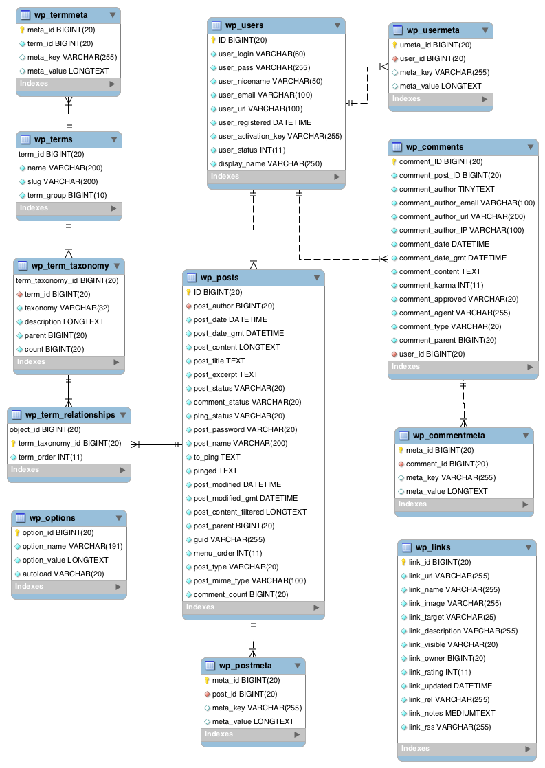
Additionally, DeliciousBrains have produced an Ultimate Developer’s Guide to the WordPress Database which gives a full account of each table’s columns and purpose.
SiteGround Portal Database Access
WordPress databases are usually accessed with phpMyAdmin – a free tool for MySQL admin over the Internet.
WPBeginner has a Beginner’s Guide To WordPress Database Management With phpMyAdmin, covering topics including restoring backups, optimisation and password resets.
While phpMyAdmin is great for basic maintenance, it’s not very convenient for data analysis:
- There are no data tools like schema visualization or query plans.
- It lacks scripting tools like IntelliSense or auto-complete.
- Accessing it usually involves accessing the web host’s portal first.
Ideally, I’d prefer to access my database remotely using a SQL client instead. While this needs some additional config, SiteGround makes this very simple!
Remote Database Access
By default, SiteGround denies any remote access requests. Many people will never use this feature, so disabling it is a good security measure. Remote access is enabled in the SiteGround portal, which grants immediate remote access for specified IPs and hostnames.
After doing that, I created a new database user with read-only (SELECT) access to the MySQL database:
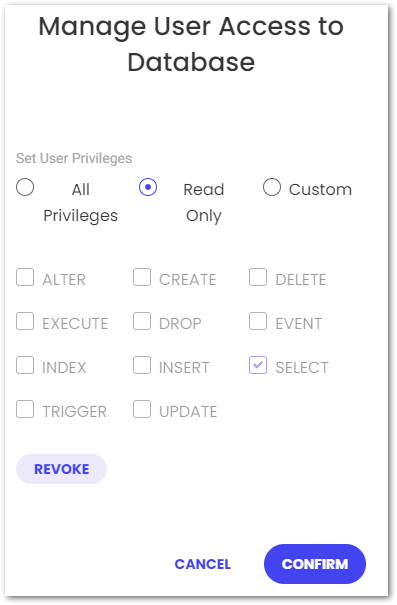
This isn’t strictly necessary, but the default user has unlimited access and violates the principle of least privilege in this situation.
The following SiteGround video demonstrates enabling remote access:
Analysis Tools
In this section, I examine the various tools I’ll use for amazonwebshark’s 1st birthday data analysis.
DBeaver
DBeaver is a free database tool and SQL client. It is multi-platform, open-source and supports a variety of databases including Microsoft SQL Server, Amazon Athena and MySQL.
DBeaver’s features include:
- Query execution.
- SQL auto-completion.
- DDL generation.
- Entity Relationship Diagram rendering.
- SSL support.
This VK Tech 360 video demonstrates connecting DBeaver to a local MySQL database:
mysql-connector-python
mysql-connector-python is a free Python driver for communicating with MySQL.
This Telusko video shows mysql-connector-python being used to access a local MySQL database:
mysql-connector-python is on PyPi and is installable via pip:
pip install mysql-connector-python
After mysql-connector-python is installed and imported, a connection to a MySQL database can be made using the mysql.connector.connect() function with the following arguments:
host: Hostname or IP address of the MySQL server.database: MySQL database name.user: User name used to authenticate with the MySQL server.password: Password to authenticate the user with the MySQL server.
This opens a connection to the MySQL server and creates a connection object. I store this in the variable conn_mysql
import mysql.connector

conn_mysql = mysql.connector.connect(
	host = var.MYSQL_HOST,
	database = var.MYSQL_DATABASE,
	user = var.MYSQL_USER,
	password = var.MYSQL_PASSWORD
	)
I have my credentials stored in a separate Python script that is imported as var. This means I can protect them via .gitignore until I get something better in place!
After that, I need a cursor for running my SQL queries. I create this using the cursor() method of my conn_mysqlcursor:
cursor = conn_mysql.cursor()
I’m now in a position to start running SQL queries from Python. I import a SQL query from my var script (in this case my Category query) and store it as query:
query = var.QUERY_CATEGORY
I then run my query using the execute() method. I get the results as a list of tuples using the fetchall() method, which I store as results:
cursor.execute(query)
results = cursor.fetchall()
Finally, I disconnect my cursor and MySQL connection with the close() method:
cursor.close()
conn_mysql.close()
Matplotlib
Matplotlib is a library for creating visualizations in Python. It can produce numerous plot types and has a large gallery of examples.
This BlondieBytes video shows a short demo of Matplotlib inside a Jupyter Notebook:
Matplotlib is on PyPi and is installable via pip:
pip install matplotlib
To view Matplotlib’s charts in Visual Studio Code I had to use an interactive window. Visual Studio Code has several options for this. Here I used the Run Current File In Interactive Window option, which needed the IPyKernel package to be installed in my Python virtual environment first.
Categories Analysis
In this section, I begin amazonwebshark’s 1st birthday data analysis by writing a SQL query for amazonwebshark’s categories and analysing the results with Python.
Categories Analysis: SQL Query
For my Category SQL query, I’ll be using the terms and term_taxonomy tables:
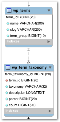
WordPress has a taxonomy system for content organization. Individual taxonomy items are called terms, and they are stored in the terms table. Terms for amazonwebshark include Data & Analytics and Security & Monitoring.
The term_taxonomy table links a term_id to a taxonomy, giving context for each term. Common taxonomies are category, post_tag and nav_menu.
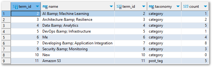
If I join these tables on term_id then I can map terms to taxonomies. In the following query results, the first two columns are from terms and the rest are from term_taxonomy:
My final query keeps the join, cleans up terms.name, returns all categories with at least one use and orders the results by term_taxonomy.countterms.name
SELECT
	REPLACE (t.name, '&', '&') AS name,
	tt.count
FROM
	term_taxonomy AS tt
INNER JOIN terms AS t ON
	tt.term_id = t.term_id
WHERE
	tt.taxonomy = 'category'
	AND tt.count > 0
ORDER BY
	tt.count ASC ,
	t.name DESC
In future, I’ll need to limit the results of this query to a specific time window. Here, I want all the results so no further filtering is needed.
Categories Analysis: Python Script
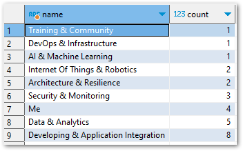
Currently, my results variable contains the results of the var.QUERY_CATEGORY SQL query. When I run print(results), I get this list of tuples:
[('Training & Community', 1), ('DevOps & Infrastructure', 1), ('AI & Machine Learning', 1), ('Internet Of Things & Robotics', 2), ('Architecture & Resilience', 2), ('Security & Monitoring', 3), ('Me', 4), ('Data & Analytics', 5), ('Developing & Application Integration', 8)]So how do I turn this into a graph? Firstly, I need to split results up into what will be my X-axis and Y-axis. For this, I create two empty lists called name and count:
name = []
count = []
After that, I populate the lists by looping through result. For each tuple, the first item is appended to namecount
for result in results:
    name.append(result[0])
    count.append(result[1])
When I print the lists now, name and count contain the names and counts from the SQL query in the same order as the original results:
print(f'name = {name}')
name = ['Training & Community', 'DevOps & Infrastructure', 'AI & Machine Learning', 'Internet Of Things & Robotics', 'Architecture & Resilience', 'Security & Monitoring', 'Me', 'Data & Analytics', 'Developing & Application Integration']
print(f'count = {count}')
count = [1, 1, 1, 2, 2, 3, 4, 5, 8]I then use these lists with Matplotlib, imported as plt:
plt.bar(name, count)
plt.xlabel("category name")
plt.ylabel("category count")
plt.title("amazonwebshark categories")
plt.show()
barsets the visual’s type as a bar chart. The X-axis isnameand the Y-axis iscount.xlabellabels the X-axis ascategory nameylabellabels the Y-axis ascategory count.titlenames the chart asamazonwebshark categoriesshowshows the graph.
The following chart is produced:
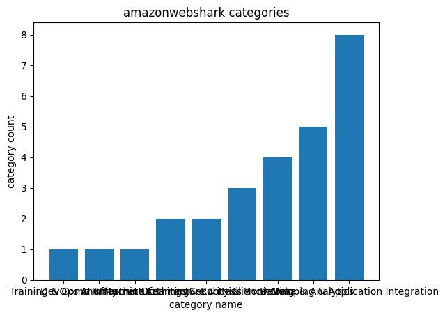
However, the X-axis labels are unreadable. I can fix this by changing my script:
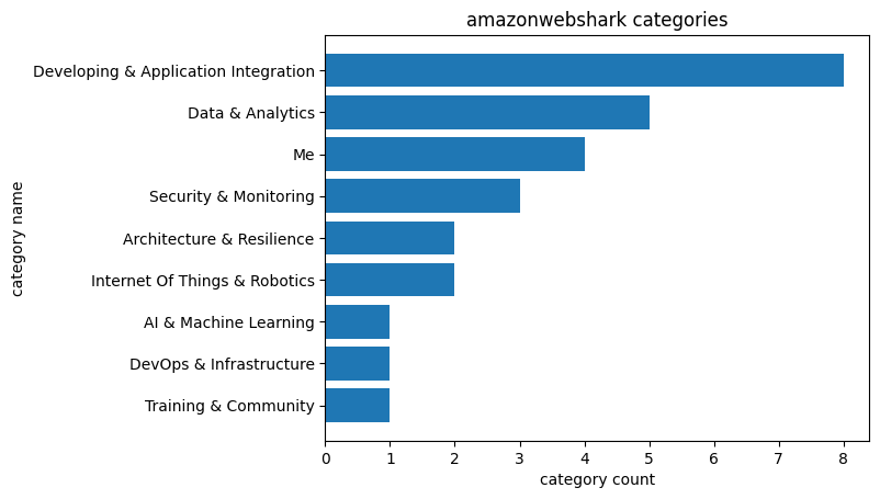
plt.barh(name, count)
plt.xlabel("count")
plt.ylabel("name")
plt.title("amazonwebshark categories")
plt.show()
I use barh to change the graph to a horizontal bar chart, and then swap the xlabel and ylabel strings around. This time the chart is far easier to read:
Tags Analysis
In this section, I continue amazonwebshark’s 1st birthday data analysis by writing a SQL query for amazonwebshark’s tags and analysing the results with Python.
Tags Analysis: SQL Query
My Tags SQL query is almost the same as my Categories one. This time, my WHERE clause is filtering on post_tag:
SELECT
	REPLACE (t.name, '&', '&') AS name,
	tt.count
FROM
	term_taxonomy AS tt
INNER JOIN terms t ON
	tt.term_id = t.term_id
WHERE
	tt.taxonomy = 'post_tag'
	AND tt.count > 0
ORDER BY
	tt.count ASC ,
	t.name DESC
There are more results this time. While I try to limit my use of categories, I’m currently using 44 tags:
Tags Analysis: Python Script
My Tags Python script is (also) almost the same as my Categories one. This time, the query variable has a different value:
query = var.QUERY_TAG
So print(results) returns a new list of tuples:
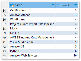
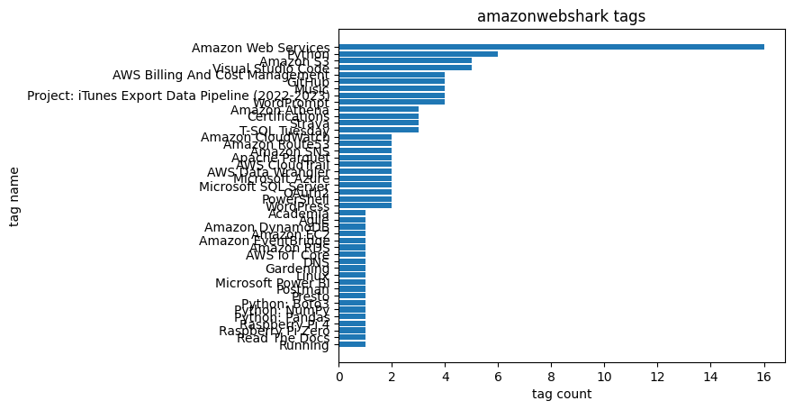
[('Running', 1), ('Read The Docs', 1), ('Raspberry Pi Zero', 1), ('Raspberry Pi 4', 1), ('Python: Pandas', 1), ('Python: NumPy', 1), ('Python: Boto3', 1), ('Presto', 1), ('Postman', 1), ('Microsoft Power BI', 1), ('Linux', 1), ('Gardening', 1), ('DNS', 1), ('AWS IoT Core', 1), ('Amazon RDS', 1), ('Amazon EventBridge', 1), ('Amazon EC2', 1), ('Amazon DynamoDB', 1), ('Agile', 1), ('Academia', 1), ('WordPress', 2), ('PowerShell', 2), ('OAuth2', 2), ('Microsoft SQL Server', 2), ('Microsoft Azure', 2), ('AWS Data Wrangler', 2), ('AWS CloudTrail', 2), ('Apache Parquet', 2), ('Amazon SNS', 2), ('Amazon Route53', 2), ('Amazon CloudWatch', 2), ('T-SQL Tuesday', 3), ('Strava', 3), ('Certifications', 3), ('Amazon Athena', 3), ('WordPrompt', 4), ('Project: iTunes Export Data Pipeline (2022-2023)', 4), ('Music', 4), ('GitHub', 4), ('AWS Billing And Cost Management', 4), ('Visual Studio Code', 5), ('Amazon S3', 5), ('Python', 6), ('Amazon Web Services', 16)]Matplotlib uses these results to produce another horizontal bar chart with a new title:
plt.barh(name, count)
plt.xlabel("count")
plt.ylabel("name")
plt.title("amazonwebshark tags")
plt.show()
But this chart has a different problem – the Y-axis is unreadable because of the number of tags returned by my SQL query:
To fix this, I reduce the number of rows returned by changing my SQL WHERE clause from:
WHERE
	tt.taxonomy = 'post_tag'
	AND tt.count > 0
to:
WHERE
	tt.taxonomy = 'post_tag'
	AND tt.count > 2
This returns a smaller list of tuples:
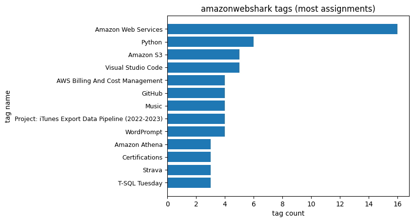
[('T-SQL Tuesday', 3), ('Strava', 3), ('Certifications', 3), ('Amazon Athena', 3), ('WordPrompt', 4), ('Project: iTunes Export Data Pipeline (2022-2023)', 4), ('Music', 4), ('GitHub', 4), ('AWS Billing And Cost Management', 4), ('Visual Studio Code', 5), ('Amazon S3', 5), ('Python', 6), ('Amazon Web Services', 16)]I then update the title to reflect the new results and use yticks to reduce the Y-axis label font size to 9:
plt.barh(name, count)
plt.xlabel("tag count")
plt.ylabel("tag name")
plt.title("amazonwebshark tags (most assignments)")
plt.yticks(fontsize = 9)
plt.show()
The chart is now more useful and easier to read:
Views Analysis
I also planned to analyse my post views here. But, as I mentioned in my last post, some of this data is missing! So any chart will be wrong.
I haven’t had time to look at this yet, so stay tuned!
Summary
In this post, I celebrated amazonwebshark’s 1st birthday with an analysis of my site’s MySQL data using DBeaver, Python and Matplotlib.
I had fun researching and writing this! It can be tricky to find a data source that isn’t contrived or overused. Having access to the amazonwebshark database gives me data that I’m personally invested in, and an opportunity to practise writing MySQL queries.
I’ve also been able to improve my Python, and meaningfully experiment with Matplotlib to get charts that will be useful going forward. For example, I used the very first Tags chart to prune some unneeded tags from my WordPress taxonomy.
If this post has been useful, please feel free to follow me on the following platforms for future updates:
Thanks for reading ~~^~~