Categories
Me

Fixing A Broken Tap With George Pólya

In this post, I use the principles in “How To Solve It” by George Pólya to diagnose and fix my broken kitchen tap. Yes – really.

Table of Contents

Introduction

Bit of a change this time. Let me set the scene.

It’s time to top up Wolfie’s water bowl, so to the kitchen sink we go. Two unexpected events happen when the tap is turned on:

  1. The water flow goes mental and starts spraying everywhere.
  2. Something gets launched out of the tap into the water bowl:
Aerator Initial

My first thought is that the tap is broken and that I’ll need to buy a new one. And then get a plumber to fit it. Great.

But wait. Last year I fixed some broken panes in our greenhouse. This year I’ve built a potting bench, fixed a leaky water butt and mounted a shower rail. Is this a problem I can solve?

This Doesn’t Sound Like Technology

True. It is, though, a chance to write a post I’ve fancied doing for a while. And this set of circumstances was too compelling to pass up.

Last year I became aware of a book called “How To Solve It” by George Pólya. The recommendation included a chart based on the book, similar to this one:

Source: KPMathematics

What struck me was how close these steps were to the Systems Development Life Cycle I was taught at college. My interest was piqued.

Around the same time, I was getting to grips with my new Data Engineer role. Since then, I’ve used the “How To Solve It” principles to help me complete work both for my role and for this blog.

Now, faced with a new unfamiliar situation, I can demonstrate how the “How To Solve It” principles can be applied beyond mathematics. In this case I’m fixing a broken tap, but this could just as easily be a Python bug, a poorly performing SQL query or an AWS authentication issue.

Here is my plan:

  • Firstly, I’ll examine the “How To Solve It” book.
  • Secondly, I’ll look at the author of the book – George Pólya.
  • Then I’ll look at each of the George Pólya principles, relating them to the broken tap problem I want to solve.

Let’s start with the book.

How To Solve It

Source: Penguin

‘A superb book on how to think fresh thoughts … A walk inside Pólya’s mind as he builds up maxims on how to comprehend a problem, how to build up a strategy, and then how to test it.’

David Bodanis, Guardian

‘Everyone should know the work of George Polya on how to solve problems’

Marvin Minsky

How To Solve It can be bought on Penguin’s website.

History

How To Solve It was written in 1945 by George Pólya. Since then, the book has stayed in print and has been translated into over a dozen languages. It has sold more than 1 million copies, making it one of the most widely circulated mathematics books in history.

Four Principles

How To Solve It explains in non-technical terms how to think about invention, discovery, creativity and analysis. Central to this are four principles:

  1. First. You have to understand the problem.
  2. Second. Find the connection between the data and the unknown. You may be obliged to consider auxiliary problems if an immediate connection cannot be found. You should obtain eventually a plan of the solution.
  3. Third. Carry out your plan
  4. Fourth. Examine the solution obtained.

The book also poses several questions for each principle. They aim to stimulate thought and produce the answers needed to satisfy each principle.

These can be seen in the below image from the book’s first edition:

2022 10 25 HowToSolveItInsideCover

They are also available as text from the University of Utah’s summary of 1957’s second edition.

Although How To Solve It was written with mathematics in mind, the book’s principles have been applied to additional disciplines over the decades. Pólya seems to take great care not to limit the scope of How To Solve It, speaking of problems in general terms throughout the book.

One such example is this extract:

A great discovery solves a great problem but there is a grain of discovery in the solution of any problem. Your problem may be modest; but if it challenges your curiosity and brings into play your inventive faculties, and if you solve it by your own means, you may experience the tension and enjoy the triumph of discovery.

“How To Solve It” – George Pólya

How To Solve It remains in high regard to this day. The Math Sorcerer produced this video in July 2022, and his affection for the book is clear.

Sources

Next, let’s look at the book’s author – George Pólya.

George Pólya

George Pólya
Source: MacTutor

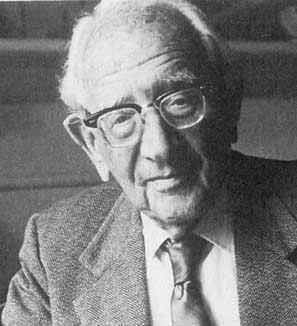
George Pólya (December 13 1887 – September 7 1985 aged 97) was a Hungarian mathematician. He was a professor of mathematics from 1914 to 1940 at ETH Zürich in Hungary, and from 1940 to 1953 at Stanford University in North America having moved there during World War 2.

After retiring from Stanford, Pólya remained active in his field. He continued his association with Stanford as Professor Emeritus well into his 90s and taught a course in their Computer Science Department in 1978.

Works

In pure mathematics, Pólya made important discoveries in fields including probability, real and complex analysis, combinatorics, geometry, number theory and mathematical physics.

Several of his discoveries bear his name, including:

Pólya also authored and contributed to numerous books and articles throughout his life, a selection of which can be seen on Wikipedia.

Recognition

Pólya was well-regarded by his peers and awards given to him included:

“He has given a new dimension to problem-solving by emphasizing the organic building up of elementary steps into a complex proof, and conversely, the decomposition of mathematical invention into smaller steps.”

and:

“Problem solving a la Polya serves not only to develop mathematical skill but also teaches constructive reasoning in general.”

Sources

There is much more to know about Pólya. The following links detail his life, works and legacy in far greater detail:

Now I’m going to apply the George Pólya principles to my broken tap!

Applying The Principles

In the following sections, I will apply each George Pólya principle from How To Solve It to my tap problem. In each section I will:

  • Quote each principle in full.
  • State the supporting questions that I’ll answer.
  • Relate these to my tap problem.

Principle 1: Understanding The Problem

First. You have to understand the problem.

“How To Solve It” – George Pólya
  • What is the unknown? What are the data? What is the condition?

The Unknown

The unknown is what I want. Here, I want to restore the tap’s original flow rate.

The Data

The data is the information available. This is what was expelled from the tap:

Aerator Initial

Other data:

  • Water was still flowing from the tap.
  • The flow of water was under more pressure than before.

The Condition

The condition is the link between the unknown and the data. Here, whatever has come out of the tap has changed the water’s flow but hasn’t obstructed it.

Principle 2: Devising A Plan

Second. Find the connection between the data and the unknown. You may be obliged to consider auxiliary problems if an immediate connection cannot be found. You should obtain eventually a plan of the solution.

“How To Solve It” – George Pólya
  • Do you know a related problem? Do you know a theorem that could be useful?
  • Here is a problem related to yours and solved before. Could you use it? Could you use its result? Could you use its method?

I searched Google for the phrase “kitchen tap water flow changed”. There was an immediate common thread in the results:

2022 10 26 GoogleResults

The Estes Services link gave a useful definition of an aerator:

“The aerator on your faucet is a mesh screen and covers the water outlet. The aerator catches minerals and other debris in your pipes. It also helps save water by introducing air into the water stream.”

“How to Fix Low Water Pressure in Kitchen” on Estes

Getting somewhere! This led me to “Everything you Need to Know About Tap Aerators” on TapWarehouse, which includes this:

“They save you water by adding oxygen to the flow (and that means saving pennies) and reduce splashing around the bowl of the basin.”

“Everything you Need to Know About Tap Aerators” on TapWarehouse

Mesh screen? Reduced splashing? This definitely sounded like the right area!

Solved Problems

At this point, what came out of the tap sounded very much like an aerator. However, there’s no cleaning something that’s disintegrated, so it was time for a replacement.

TapWarehouse to the rescue again:

“If your existing tap already has an aerator, simply turn it anticlockwise until it’s unscrewed from the tap. Then, simply screw in the new aerator until it’s secure, being careful not to screw it too tightly.”

How can I Install a Tap Aerator?” on TapWarehouse

TapWarehouse also gave advice on aerator types. There are male and female aerators depending on the tap. There are also various aerator sizes ranging from 16mm to 28mm.

Planned Solution

Based on this research, the solution needed the following steps:

  • Remove the broken aerator.
  • Confirm the aerator type.
  • Confirm the aerator size.
  • Buy a replacement aerator.
  • Fit the replacement aerator.
  • Test the replacement aerator.

Principle 3: Carrying Out The Plan

Third. Carry out your plan.

“How To Solve It” – George Pólya
  • Carrying out your plan of the solution, check each step. Can you see clearly that the step is correct?

Time to remove the broken aerator! Straight into a problem. It wouldn’t budge.

Fortunately, there’s a DIY StackExchange! Advice ranged from WD-40 to vinegar to a hammer and chisel (!), but in the end I used my heat gun on the aerator and removed it with pliers.

I then determines that I needed a 24mm male aerator as a replacement. One trip to B&Q later and:

Aerator Replacement

Fitting the new aerator was a simple matter of screwing it on.

Principle 4: Looking Back

Fourth. Examine the solution obtained.

“How To Solve It” – George Pólya
  • Can you check the result?

BEHOLD:

Tap with running water

Summary

In this post, I used the principles in “How To Solve It” by George Pólya to diagnose and fix my broken kitchen tap. I applied each of the Pólya principles to my problem, and was able to solve it by answering the relevant questions and doing some investigation with the knowledge gained.

If this post has been useful, please feel free to follow me on the following platforms for future updates:

Thanks for reading ~~^~~

Categories
Data & Analytics

Writing User Stories For An iTunes Dashboard

In this post, I use Agile Methodology to collect requirements and write user stories for my iTunes dashboard.

Table of Contents

Introduction

In my recent posts, I’ve been building a basic data pipeline for an iTunes export file. So far I have:

Now I can think about analysing this data. I’m building a dashboard for this as they offer advantages including:

  • Dashboards communicate information quickly without having to run reports or write queries.
  • It is easy to sort and filter dashboards.
  • Using dashboard visuals doesn’t require knowledge of the maths and scripting behind them.
  • Dashboard visuals can interact with each other and respond to changes and selections.

Before I start thinking about my dashboard I should review the data. My preferred way of doing this is to create a data dictionary, so let’s start there.

Data Dictionary

In this section, I will explain what a data dictionary is and create one for the iTunes data in my Athena table.

Data Dictionary Introduction

A data dictionary is data about data. Just like a dictionary contains information on and definitions of words, IBM’s Dictionary of Computing defines a data dictionary as:

“a centralized repository of information about data such as meaning, relationships to other data, origin, usage, and format”

IBM Dictionary of Computing

Typical attributes of data dictionaries include:

  • Data type
  • Description
  • Conditions: Is the data required? Does it have dependencies?
  • Default value
  • Minimum and maximum values

There are numerous online resources about data dictionaries. I like this video as a gentle introduction to the topic using real-world examples:

Now let’s apply this to my iTunes data.

iTunes Data Dictionary

Here, I have written a short data dictionary to give my data some context. I have divided the dictionary into data types and given a brief description of each field.

Some fields have two field names because they will be renamed on the dashboard:

  • album will become key as iTunes has no field for musical keys, so I use album instead.
  • name will become title for clarity.
  • tracknumber will become bpm as, although iTunes does have a BPM field, this is not included in its export files.

Strings:

  • album / key: A track’s musical key.
  • artist: A track’s artist(s).
  • genre: A track’s music genre.
  • name / title: A track’s title and mix.

Integers:

  • myrating: A track’s rating in iTunes. Min 0 Max 100 Interval +20.
  • myratingint: A track’s rating as an integer. Min 0 Max 5 Interval +1.
  • plays: A track’s total play count.
  • tracknumber / bpm: A track’s tempo in beats per minute.
  • year: A track’s year of release.

DateTimes:

  • dateadded: The date & time a track was added to iTunes.
  • datemodified: The date & time a track was last modified in iTunes.
  • lastplayed: The date & time a track was last played in iTunes.
  • dateaddeddate: The date a track was added to iTunes.
  • datemodifieddate: The date a track was last modified in iTunes.
  • lastplayeddate: The date a track was last played in iTunes.

For context, this is a typical example of a track’s details in the iTunes GUI:

2022 09 14 iTunesTrackExample

For completeness, dateadded and datemodified are recorded in the File tab.

Now that the data is defined, I can start thinking about the dashboard. But where do I start?

Beginning The Design Process

In this section, I talk about how I got my dashboard design off the ground.

I didn’t decide to write user stories for my iTunes dashboard straightaway. This post took a few versions to get right, so I wanted to spend some time here running through my learning process.

Learning From The Past

This isn’t the first time I’ve made a dashboard for my own use. However, I have some unused and abandoned dashboards that usually have at least one of these problems:

  • They lack clarity and/or vision, resulting in a confusing user experience.
  • The use of excessive tabs causes a navigational nightmare.
  • Visuals are either poorly or incorrectly chosen.
  • Tables include excessive amounts of data. Even with conditional formatting, insights are hard to find.

When I started designing my iTunes dashboard, I was keen to make something that would be useful and stand the test of time. Having read Information Dashboard Design by Stephen Few, it turns out the problems above are common in dashboard design.

In his book, Stephen gives guidance on design considerations and critiques of sample dashboards that are just as useful now as they were when the book was published in 2006.

So I was now more clued up on design techniques. But that’s only half of what I needed…

What About The User?

I searched online for dashboard design tips while waiting for the book to arrive. While I did get useful results, they didn’t help me answer questions like:

  • How do I identify a dashboard’s purpose and requirements?
  • How do I justify my design choices?
  • What do I measure to confirm that the dashboard adds value?

I was ultimately pointed in the direction of Agile Analytics: A Value-Driven Approach to Business Intelligence and Data Warehousing by Dr Ken Collier. In this book, Ken draws on his professional experience to link the worlds of Business Intelligence and Agile Methodology, including sections on project management, collaboration and user stories.

(I should point out that I’ve only read Chapters 1: Agile Analytics: Management Methods and Chapter 4: User Stories for BI Systems currently, but I’m working on it!)

Wait! I’ve used Agile before! Writing user stories for my iTunes dashboard sounds like a great idea!

So let’s talk about Agile.

Introducing Agile

In this section, I will introduce some Agile concepts and share resources that helped me understand the theory behind them.

Agile Methodology

Agile is a software development methodology focusing on building and delivering software in incremental and iterative steps. The 2001 Manifesto for Agile Software Development declares the core Agile values as:

  • Individuals and interactions over processes and tools.
  • Working software over comprehensive documentation.
  • Customer collaboration over contract negotiation.
  • Responding to change over following a plan.

Online Agile resources are plentiful. Organisations like Atlassian and Wrike have produced extensive Agile resources that are great for beginners and can coach the more experienced.

For simpler introductions, I like Agile In A Nutshell and this Development That Pays video:

Epics

Kanbanize defines Epics as:

“…large pieces of work that can be broken down into smaller and more manageable work items, tasks, or user stories.”

“What Are Epics in Agile? Definition, Examples, and Tracking” by Kanbanize

I found the following Epic resources helpful:

  • Finally, this Dejan Majkic video explains Epics at a high level:

User Stories

Digité defines a User Story as:

“…a short, informal, plain language description of what a user wants to do within a software product to gain something they find valuable.”

“User Stories: What They Are and Why and How to Use Them” by Digité

I found the following User Story resources helpful:

  • Firstly, Atlassian’s article about User Stories explains the theory behind them, introducing User Stores as part of a wider Agile Project Management section.
  • This femke.design video gives a great personable introduction to User Stories:
  • Finally, this Atlassian video assumes some knowledge of User Stories and has more of a training feel:

Personas

Wrike defines Personas as:

“…fictional characteristics of the people that are most likely to buy your product. Personas provide a detailed summary of your ideal customer including demographic traits such as location, age, job title as well as psychographic traits such as behaviors, feelings, needs, and challenges.”

“What Are Agile Personas?” by Wrike
  • This Atlassian video gives additional tips and advice on creating personas:

That’s all the theory for now! Let’s begin writing the user stories I’m going to use for my iTunes dashboard, starting by creating a persona.

My Persona

In this section, I will create the persona I’ll use to write the epic and user stories for my iTunes dashboard. But why bother?

Why Create A Persona?

Some sources consider personas to be optional while others prioritise them highly. I’m using one here for a few reasons:

  • Firstly, I’m my own customer here. Using a persona will make it easier to identify my requirements, and ringfence ‘engineer me’ from ‘user me’.
  • Secondly, the persona will help to focus the project. Once the persona’s goals have been defined, they will present a clear target to work towards.
  • Finally, creating a persona makes this post far easier to write! Pulling my requirements out of thin air doesn’t feel authentic, and writing about myself in the third person is WEIRD.

So who is this persona?

Introducing Biscuit

Meet my stakeholder, Biscuit:

PXL 20220914 165327222 2 600450
That’s not what stakeholder means! – Ed

Being Biscuit

Biscuit is a sassy, opinionated shark that will tell anyone who listens about when he met Frank Sidebottom.

Biscuit likes listening to dance music. He has a collection of around 3500 tracks and uses iTunes smart playlists to listen to them. His collection ranges from Deep House at around 115 BPM to Drum & Bass at around 180 BPM.

Biscuit is a bit of a music geek. He found out about music theory when he saw key notations on his Anjunabeats record sleeves and wondered what they meant. He uses Mixed In Key to scan his collection, so each track has rich metadata.

Biscuit has various playlists depending on his mood, location and/or activity. He likes to choose between recent favourites and tunes he’s not heard for a while.

Biscuit doesn’t use music streaming services and doesn’t want to due to the internet requirement and the bitrates offered.

Biscuit’s Challenges

The current process of creating new smart playlists involves spending time looking through existing playlists and using trial and error. This usually takes at least an hour and doesn’t guarantee good results.

As the current process of generating new playlists is undesirable, existing and legacy playlists are being used more often. This is creating problems:

  • Tracks in those playlists get disproportionate plays and become stale, while tracks not in those playlists don’t get played for ages.
  • Underused playlists consume iTunes compute resources and iPhone storage space.
  • Time and money are being spent on adding new tracks to the collection as no simple process exists to identify lesser played tracks.

Biscuit’s Goals

Biscuit wants a quicker way to use his iTunes data for building smart playlists. Specifically, he wants to know about the tracks he plays most and least often so that future smart playlists can be focused accordingly.

Biscuit would like to visualise his iTunes data in a dashboard. The dashboard should show:

  • If any listening trends or behaviours exist.
  • Traits of disproportionately overplayed and underplayed tracks.

Biscuit also wants to know if the following factors influence how many times a track is played:

  • BPM: Is there a relationship between a track’s tempo and its play count?
  • Date Added: Recently added tracks will usually have fewer plays, but what about tracks that have been in the collection longer? Do tracks exist with older dateadded dates and low play counts?
  • Rating: The assumption would be that tracks with higher ratings will get played more. Is this correct?
  • Year: Are tunes produced in certain years played more than others? Are there periods of time that future smart playlists should target?

My Epic And User Stories

In this section, I will write the epic and user stories that I will use to design and create my iTunes dashboard.

Designing a dashboard would usually be a user story in an epic – I’ve allocated a user story to each dashboard visual to help keep me focused, as time is currently tight and it can be challenging to time for this!

Epic: iTunes Play Counts Dashboard

As a playlist builder, Biscuit wants to use a dashboard to analyse the play counts in his iTunes data so that he can simplify the process of creating new smart playlists.

ACCEPTANCE CRITERIA:

  • Biscuit can analyse play totals and see how they are distributed between bpm, dateadded, rating and year fields.
  • Biscuit can use the dashboard for architecting new smart playlists instead of iTunes.
  • Biscuit can access the dashboard on PC and mobile.
  • The dashboard’s operational costs must be minimal.

User Story: Plays Visual

As a playlist builder, Biscuit wants to see play totals so that it is easier to review and manage his current play intervals.

ACCEPTANCE CRITERIA:

  • Biscuit can see and sort totals of individual plays.
  • Biscuit can see and sort totals of current play intervals.
  • The dashboard can be filtered by plays and current play intervals.
  • The dashboard must use the following play intervals:
    • P0: unplayed.
    • P01-P05: between 1 and 5 plays.
    • P06-P10: between 6 and 10 plays.
    • P11-P20: between 11 and 20 plays.
    • P21-P30: between 21 and 30 plays.
    • P31+: over 30 plays.

User Story: BPMs Visual

As a playlist builder, Biscuit wants to see how plays are distributed between track BPMs so that he can identify how BPMs influence which tracks are played most and least often.

ACCEPTANCE CRITERIA:

  • Biscuit can see relationships between BPMs and play totals at a high level.
  • Biscuit can both filter the visual and drill down for added precision.
  • The dashboard can be filtered by both BPMs and current BPM intervals.
  • The dashboard must use the following BPM intervals:
    • B000-B126: 126 BPM and under.
    • B127-B129: 127 BPM to 129 BPM.
    • B130-B133: 130 BPM to 133 BPM.
    • B134-B137: 134 BPM to 137 BPM.
    • B138-B140: 138 BPM to 140 BPM.
    • B141-B150: 141 BPM to 150 BPM.
    • B151+: 151 BPM and over.

User Story: Ratings Visual

As a playlist builder, Biscuit wants to see how plays are distributed between iTunes ratings so that he can identify how ratings influence which tracks are played most and least often.

ACCEPTANCE CRITERIA:

  • Biscuit can see relationships between ratings and play totals at a high level.
  • Biscuit can both filter the visual and drill down for added precision.
  • The dashboard can be filtered by rating.

User Story: Date Added Visual

As a playlist builder, Biscuit wants to see how plays are distributed relative to when tracks were added to the collection so that he can identify tracks with abnormally high and low play totals relative to how long they have been in the collection.

ACCEPTANCE CRITERIA:

  • Biscuit can see relationships between the year tracks were added to the collection and play totals at a high level.
  • Biscuit can both filter the visual and drill down for added precision.
  • The dashboard can be filtered by the years that tracks were added in.

User Story: Year Visual

As a playlist builder, Biscuit wants to see how plays are distributed relative to track production years so that he can identify how production years influence which tracks are played most and least often.

ACCEPTANCE CRITERIA:

  • Biscuit can see relationships between production years and play totals at a high level.
  • Biscuit can both filter the visual and drill down for added precision.
  • The dashboard can be filtered by production year.

Summary

In this post, I used Agile Methodology to collect requirements and wrote user stories for my iTunes dashboard.

I created a data dictionary to give context to my iTunes data, examined some high-level Agile concepts and used a persona to write five user stories that I will use to create my iTunes dashboard.

If this post has been useful, please feel free to follow me on the following platforms for future updates:

Thanks for reading ~~^~~

Categories
Data & Analytics

Connecting Athena To Power BI With Simba Athena

In this post, I use Simba Athena to create a secure connection between my iTunes data in Amazon Athena and Microsoft Power BI.

Table of Contents

Introduction

In my recent posts, I’ve been transforming an iTunes Export CSV file using Python and AWS.

Firstly, in July I built a Python ETL that extracts data from my iTunes CSV into a Pandas DataFrame and transforms some columns.

Next, I updated my ETL script at the start of August. It now uploads the changed data to S3 as a Parquet file. Then I made my data available in an Athena table so I could use some of Athena’s benefits:

  • My data now has high availability at low cost.
  • My data can be queried faster from Athena than from the CSV.
  • I can limit what data is accessed, as opposed to all-or-nothing.

Now I want to start analysing my data. There are many business intelligence (BI) tools available to help me with this. I will be using the latest version of Power BI on my Windows 10 laptop.

But wait. If Power BI is on my laptop and my data is in Athena, how can Power BI access my data? Do I need to make my AWS resources publically accessible? Do I need to download the data to my laptop?

Fortunately not! Welcome to the world of data connectors. Meet Simba Athena.

Simba Athena

In this section, I will look at how Simba Athena bridges the gap between my locally-installed BI tool and my data in AWS.

What Is Simba Athena?

Simba Athena is an Open Database Connectivity (ODBC) driver built for Athena. The history of Simba dates back to 1992 when Simba Technologies co-developed the first standards-based ODBC driver with Microsoft. Magnitude acquired Simba Technologies in 2016.

Simba offers numerous data connectors that all work in roughly the same way:

Relating this diagram to Athena and Power BI:

  • The user sends a query to Power BI.
  • Power BI passes the query to Simba Athena via the ODBC Device Manager.
  • Simba Athena queries Athena and gets the results.
  • Simba Athena passes the results to Power BI via the ODBC Device Manager.
  • Power BI shows the results to the user.

Features Of Simba Athena

Simba Athena has several features that make it a great partner for Athena:

  • Simba Athena works with Windows, macOS and Linux. Just as Athena supports multiple operating systems, Simba Athena is also OS-agnostic.
  • Numerous applications support Simba Athena including Excel, Tableau and Power BI.

Speaking of Power BI…

Microsoft Power BI

In this section, I will examine Power BI and explain why I chose to use it.

What Is Power BI?

Microsoft Power BI is a data visualization solution with a primary focus on BI. At the time of writing, Power BI’s main components are:

  • Power BI Desktop: a free locally-installed application designed for connecting to, transforming, and visualizing data.
  • Power BI Service: a cloud-based SaaS supporting the deployment and sharing of dashboards.
  • Power BI Mobile: a mobile app platform for Windows, iOS, and Android devices.

So what makes Power BI a good choice here?

Choosing Power BI

My decision to use Power BI came down to three factors:

  • Prior Experience. I’ve used Power BI many times over the years, and have become very familiar with it. This will let me deliver results quickly.
  • Support: Both Microsoft and AWS have rich documentation for Simba Athena. This gives me confidence in setting it up and reduces the chance of any blockers.
2022 Gartner Magic Quadrant for Analytics and Business Intelligence Platforms

So now I’ve talked about Simba Athena and Power BI, let’s get them working together.

Setting Up Simba Athena

In this section, I will install and configure Simba Athena on my laptop. I will then attempt to extract data from Athena using Power BI.

The remainder of this post will focus on the Windows version of Simba Athena. AWS offers download links for Windows, Linux and macOS, and provides installation instructions in the Simba Athena Documentation.

Downloading Simba Athena

The first step is to download the Simba Athena ODBC driver provided by AWS. The options vary depending on platform and bitness.

The installation process mainly focuses on the end-user license agreement and destination folder selection. Once Simba Athena is installed, it can be configured.

Configuring Simba Athena

Simba Athena’s configuration settings are available via the Windows ODBC Data Source Administrator. This can be found in the Start Bar’s Windows Administrative Tools folder, or by running a Windows search for ODBC.

Accessing this and selecting the System DSN tab shows Simba Athena as a System Data Source:

2022-08-28-SimbaSystemDSN

From here, selecting Configure shows a setup screen with a few familiar fields:

Of these, Catalog, Schema and Workgroup are pre-populated with Athena defaults and Metadata Retrieval Method is set to Auto.

That leaves the Data Source Name and Description to identify the data source, and the AWS Region containing the Athena data.

In Output Options, I can state my S3 Output Location and Encryption Options. The output location is Athena’s Query Result Location, and the encryption options should mirror the S3 bucket’s encryption settings.

If the S3 Output Location is left blank, this will cause an error when Power BI tries to connect to Athena:

Details: "ODBC: ERROR [HY000] [Simba][Athena] (1040) An error has been thrown from the AWS Athena client. Athena Error No: 130, HTTP Response Code: 400, Exception Name: InvalidRequestException, Error Message: outputLocation is null or empty 

Simba Athena’s remaining settings are out of scope for this post, although there’s one I definitely need to mention – Authentication Options:

This is how Simba Athena authenticates its requests to AWS. As mentioned earlier, there are several options here. Depending on the authentication type selected, Simba Athena can store Access Keys, Session Tokens, TenantIDs and any other required credentials.

That’s all the Simba Athena configuration I’m going to do here. For full details on all of Simba Athena’s features, please refer to the Simba Athena Documentation.

Now let’s use Simba Athena to get Athena and Power BI talking to each other!

Using Simba Athena

The Athena documentation has a great section about using the Athena Power BI connector. After launching Power BI and selecting Amazon Athena as a data source, Power BI will need to know which DSN to use.

This is the Simba Athena DSN in the System DSN tab:

The Navigator screen then shows my Athena data catalog, my blog_amazonwebshark database, and my basic_itunes_python_etl table with a sample of the data it contains:

That’s everything! My basic_itunes_python_etl Athena table is now available in Power BI.

Summary

In this post, I used Simba Athena to create a secure connection between my iTunes data in Amazon Athena and Microsoft Power BI.

This post was originally part of a larger post that is still being written. But after I’d finished my Simba Athena section it made sense to have a separate post for it!

Finally, in other news, this post’s featured image is a DALL·E 2 creation. This was by far the best image it gave me for pixel art baby lion and shark – I’m sure it’ll improve soon!

If this post has been useful, please feel free to follow me on the following platforms for future updates:

Thanks for reading ~~^~~