Categories
Data & Analytics

WordPress MySQL Database Tables Deep Dive

In this post, I do a deep dive into some of the amazonwebshark WordPress MySQL database tables following the journey of a recent post.

Table of Contents

Introduction

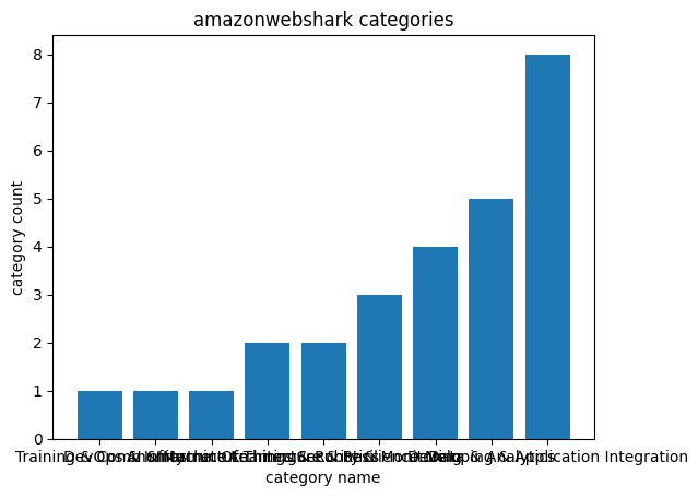
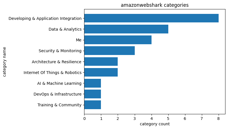
In January I used Python and Matplotlib to create some visualisations using the WordPress amazonwebshark MySQL database.

Since then I’ve been doing a lot with Power BI at work, so I’ve created a Power BI connection to the amazonwebshark database to reacquaint myself with some features and experiment with a familiar dataset.

I talked about doing a views analysis in January’s post. While some of the 2022 data is missing, I can still accurately analyse 2023 data. I plan to measure:

  • Total views for each post.
  • Total views for each category.

I’ll use this post to examine some of the MySQL tables, and link back to it in future analysis posts.

Let’s begin with a brief WordPress database overview.

WordPress Database 101

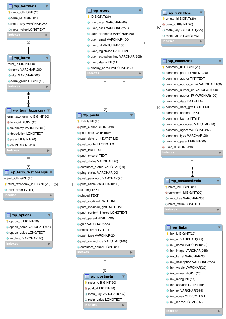
In this section, I take a high-level view of a typical WordPress database and identify the tables I’ll need.

There’s plenty of great documentation online about typical WordPress installations. I’m particularly keen on The Ultimate Developer’s Guide to the WordPress Database by DeliciousBrains, which includes an in-depth tour of the various tables.

As for table relationships, this WordPress ERD shows object names, primary keys and relationship types:

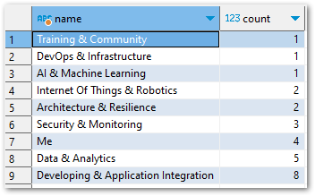
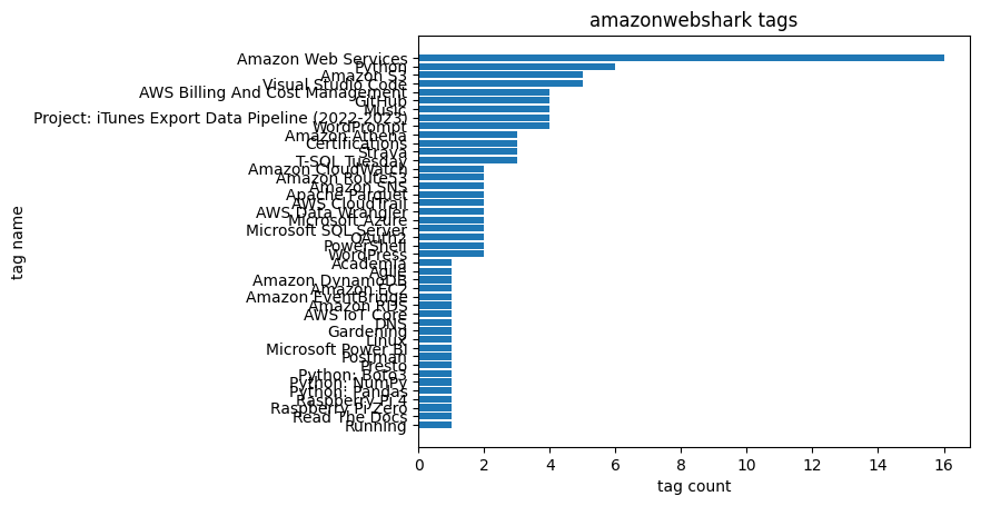
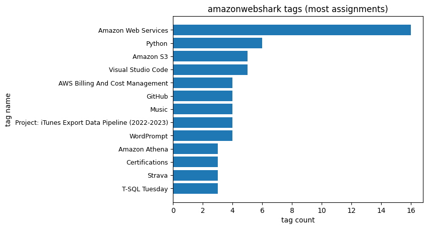
I’ll be concentrating on these WordPress tables:

And the wp_statistics_pages table used by WPStatistics.

I’ll examine each table in the context of a recent post: DBeaver OpenAI ChatGPT Integration.

wp_posts

In this section of my WordPress database deep dive, I examine the most important WordPress database table: wp_posts.

Table Purpose

WordPress uses wp_posts to manage a site’s content. Each row in the table is an event relating to a piece of content, like a post, page or attachment. Examples of these events in the context of a blog post are:

  • Creating A New Draft: A new row is created with a post_status of draft. This row is the parent of all future activity for the blog post.
  • Updating A Draft: A new row is created with details of the update. The new row’s post_parent is set to the initial post’s ID.
  • Publishing A Draft: The initial row’s post_status is changed to publish, and the post_date is changed to the publication date. WordPress finds revisions to the post by filtering rows with a post_parent matching the initial row’s ID.

Post Journey

Let’s start by finding DBeaver OpenAI ChatGPT Integration‘s parent row, which is its earliest record. The following query finds rows where the post_title is DBeaver OpenAI ChatGPT Integration, then orders by ID and returns the first result.

SELECT 
  id, 
  post_date, 
  post_title, 
  post_status, 
  post_name, 
  post_parent, 
  post_type 
FROM 
  `wp_posts` 
WHERE 
  post_title = 'DBeaver OpenAI ChatGPT Integration' 
ORDER BY 
  id 
LIMIT 
  1

Note that I order by ID, not post_date. The publication process changes the parent post’s post_date, so I must use ID to find the earliest post.

This record is returned:

Name Value
ID 1902
post_date 2023-02-19 20:28:22
post_title DBeaver OpenAI ChatGPT Integration
post_status publish
post_name dbeaver-openai-chatgpt-integration
post_parent 0
post_type post

So the DBeaver OpenAI ChatGPT Integration parent row is ID 1902. I can use this to count the number of changes to this post by searching for wp_posts rows with a post_parent of 1902:

SELECT 
  COUNT(*) 
FROM 
  `wp_posts`
WHERE 
  post_parent = 1902

81 rows are returned:

Name    |Value|
--------+-----+
COUNT(*)|81   |

Now let’s examine these results more closely.

In the following query, I get all rows relating to DBeaver OpenAI ChatGPT Integration and then group the results by:

  • Date the post was made (using the MySQL DATE function to remove the time values for more meaningful aggregation).
  • Status of the post.
  • Post’s parent post.
  • Type of post.

I also count the rows that match each group and order the results by ID to preserve the event order:

SELECT 
  COUNT(*) AS ID_count, 
  DATE(post_date) AS post_date, 
  post_status, 
  post_parent, 
  post_type 
FROM 
  `wp_posts`
WHERE 
  ID = 1902 
  OR post_parent = 1902 
GROUP BY 
  DATE(post_date), 
  post_status, 
  post_parent, 
  post_type 
ORDER BY 
  ID

The query results are below. A couple of things to note:

  • The first two columns show what happens when a post is published. Row 1 is ID 1902 as it has no post_parent, and it has a post_status of publish and a post_date of 2023-02-19.
  • Row 2 is the first revision of ID 1902, and it has a post_status of inherit and a post_date of 2023-02-15. This is why I order by ID instead of post_date – ordering by post_date would show the revisions before the parent post in the results.
  • There are various post_type valves – revisions are text updates and attachments are image updates.
ID_count post_date post_status post_parent post_type
1 2023-02-19 publish 0 post
1 2023-02-15 inherit 1902 revision
19 2023-02-16 inherit 1902 revision
7 2023-02-16 inherit 1902 attachment
24 2023-02-17 inherit 1902 revision
1 2023-02-17 inherit 1902 attachment
7 2023-02-18 inherit 1902 revision
21 2023-02-19 inherit 1902 revision
1 2023-02-26 inherit 1902 revision

Spotlighting some of these results for context:

  • On 2023-02-16 there were 19 text revisions and 7 images attached. I save a lot!
  • On 2023-02-19 there were 21 text revisions and then the post was published.
  • There was a further text revision on 2023-02-26 in response to a DBeaver software update.

That’s enough about wp_posts for now. Next, let’s start examining how WordPress groups content.

wp_term_relationships

In this section, I examine the first of the WordPress taxonomy tables: wp_term_relationships.

Table Purpose

wp_term_relationships stores information about the relationship between posts and their associated taxonomy terms (More on taxonomies in the next section). WordPress uses it as a bridge table between wp_posts and the various taxonomy tables.

Post Journey

In this query, I join wp_term_relationships to wp_posts on object_id (this is ID in wp_posts), then find the rows where either wp_posts.id or wp_posts.post_parent is 1902:

SELECT 
  yjp.ID, 
  DATE(yjp.post_date) AS post_date, 
  yjp.post_type, 
  yjp.post_status,
  yjtr.object_id, 
  yjtr.term_taxonomy_id 
FROM 
  `wp_posts` AS yjp 
  INNER JOIN `wp_term_relationships` AS yjtr 
    ON yjtr.object_id = yjp.ID 
WHERE 
  yjp.ID = 1902 
  OR yjp.post_parent = 1902

wp_term_relationships only contains published posts, so the only rows returned concern the parent ID 1902:

ID post_date post_type post_status object_id term_taxonomy_id
1902 2023-02-19 post publish 1902 2
1902 2023-02-19 post publish 1902 69
1902 2023-02-19 post publish 1902 71
1902 2023-02-19 post publish 1902 74
1902 2023-02-19 post publish 1902 76
1902 2023-02-19 post publish 1902 77

The query returned six distinct wp_term_relationships.term_taxonomy_id values. My next step is to establish what these IDs relate to.
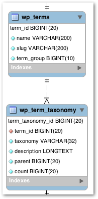
wp_term_taxonomy

In this section, I examine the table that groups term_taxonomy_id values into taxonomy types: wp_term_taxonomy.

Table Purpose

WordPress uses the wp_term_taxonomy table to store the taxonomy data for terms. Taxonomies in WordPress are used to group posts and custom post types together. Examples of WordPress taxonomies are category, post_tag and nav_menu.

Post Journey

In this query, I add a new join to the previous query, joining wp_term_taxonomy to wp_term_relationships on term_taxonomy_id. Some of the wp_posts columns have been removed from the query to save space.

SELECT 
  yjp.ID,  
  yjtr.term_taxonomy_id, 
  yjtt.taxonomy
FROM 
  `wp_posts` AS yjp 
  INNER JOIN `wp_term_relationships` AS yjtr 
    ON yjtr.object_id = yjp.ID 
  INNER JOIN `wp_term_taxonomy` AS yjtt 
    ON yjtr.term_taxonomy_id = yjtt.term_taxonomy_id 
WHERE 
  yjp.ID = 1902 
  OR yjp.post_parent = 1902

These results give some content to the previous results. I can now see that wp_posts.id 1902 has one category and five tags.

ID term_taxonomy_id taxonomy
1902 2 category
1902 69 post_tag
1902 71 post_tag
1902 74 post_tag
1902 76 post_tag
1902 77 post_tag

To get the names of the categories and tags, I must bring one more table into play…

wp_terms

In this section of my WordPress database deep dive, I examine the table that holds the names and details of the taxonomy terms used on amazonwebshark: wp_terms.

Table Purpose

The wp_terms table stores all of the terms that are used across all taxonomies on a WordPress site. Each row represents a single term, and the columns in the table contain information about that term, including name and ID.

Post Journey

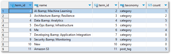
In this query, I add another join to the previous query, joining wp_terms to wp_term_taxonomy on term_id.

SELECT 
  yjp.ID, 
  yjtr.term_taxonomy_id, 
  yjtt.taxonomy,
  yjt.name 
FROM 
  `wp_posts` AS yjp 
  INNER JOIN `wp_term_relationships` AS yjtr 
    ON yjtr.object_id = yjp.ID 
  INNER JOIN `wp_term_taxonomy` AS yjtt 
    ON yjtr.term_taxonomy_id = yjtt.term_taxonomy_id 
  INNER JOIN `wp_terms` AS yjt 
    ON yjtt.term_id = yjt.term_id 
WHERE 
  yjp.ID = 1902 
  OR yjp.post_parent = 1902

The results now identify the category and each of the five tags by name:

ID term_taxonomy_id taxonomy name
1902 2 category AI & Machine Learning
1902 69 post_tag WordPress
1902 71 post_tag DBeaver
1902 74 post_tag MySQL
1902 76 post_tag OpenAI
1902 77 post_tag ChatGPT

This is a perfect match for the post’s taxonomy in the WordPress portal:

2023 03 10 WordPressPanelChatGPT

So that’s the categories. What about the views?

wp_statistics_pages

In this final section, I examine the WPStatistics table that holds view counts: wp_statistics_pages.

Table Purpose

WPStatistics uses wp_statistics_pages to store data about page views. Each row shows a URI’s total views on the date specified.

WPStatistics documentation isn’t as in-depth as WordPress, so here are the table’s DDL and column descriptions:

CREATE TABLE `1yJ_statistics_pages` (
  `page_id` bigint(20) NOT NULL AUTO_INCREMENT,
  `uri` varchar(190) NOT NULL,
  `type` varchar(180) NOT NULL,
  `date` date NOT NULL,
  `count` int(11) NOT NULL,
  `id` int(11) NOT NULL,
  PRIMARY KEY (`page_id`),
  UNIQUE KEY `date_2` (`date`,`uri`),
  KEY `url` (`uri`),
  KEY `date` (`date`),
  KEY `id` (`id`),
  KEY `uri` (`uri`,`count`,`id`)
)
Table NameDescription
page_idPrimary key. Unique identifier for the table.
uriUniform Resource Identifier used to access a page.
typeuri type: home / page / post
dateDate the uri was viewed
counturi total views on the specified date
iduri ID in wp_posts.ID

Post Journey

As wp_statistics_pages.id is the same as wp_posts.id, I can use id 1902 in a query knowing it will still refer to DBeaver OpenAI ChatGPT Integration.

For example, this query counts the number of rows in wp_statistics_pages relating to id 1902:

SELECT 
  COUNT(*) 
FROM 
  `wp_statistics_pages` 
WHERE 
  id = 1902
COUNT(*)|
--------+
      14|

I can also calculate how many visits DBeaver OpenAI ChatGPT Integration has received by using SUM on all wp_statistics_pages.count values for id 1902:

SELECT 
  SUM(yjsp.count) 
FROM 
  `wp_statistics_pages` AS yjsp
WHERE 
  yjsp.id = 1902
SUM(count)|
----------+
        40|

So the page currently has 40 views. I can see how these views are made up by selecting and ordering by wp_statistics_pages.date:

SELECT 
  yjsp.date, 
  yjsp.count 
FROM 
  `wp_statistics_pages` AS yjsp
WHERE 
  yjsp.id = 1902 
ORDER BY 
  yjsp.date

date count
2023-02-19 1
2023-02-20 5
2023-02-21 1
2023-02-22 4
2023-03-07 6
2023-03-08 3
2023-03-09 2
2023-03-10 1

I can also join wp_posts to wp_statistics_pages on their id columns, bridging the gap between the WPStatistics table and the standard WordPress tables:

SELECT 
  yjsp.date, 
  yjsp.count, 
  yjp.post_title 
FROM 
  `wp_statistics_pages` AS yjsp 
  INNER JOIN `wp_posts` AS yjp 
    ON yjsp.id = yjp.id 
WHERE 
  yjsp.id = 1902 
ORDER BY 
  yjsp.date
date count post_title
2023-02-19 1 DBeaver OpenAI ChatGPT Integration
2023-02-20 5 DBeaver OpenAI ChatGPT Integration
2023-02-21 1 DBeaver OpenAI ChatGPT Integration
2023-02-22 4 DBeaver OpenAI ChatGPT Integration
2023-03-07 6 DBeaver OpenAI ChatGPT Integration
2023-03-08 3 DBeaver OpenAI ChatGPT Integration
2023-03-09 2 DBeaver OpenAI ChatGPT Integration
2023-03-10 1 DBeaver OpenAI ChatGPT Integration

Summary

In this post, I did a deep dive into some of the amazonwebshark WordPress MySQL database tables following the journey of a recent post.

I’ve used this post to present the journey a typical post goes through in the WordPress database. Future posts will use this knowledge and the WordPress database as a data source for various dashboards, scripting and processes. Watch this space!

If this post has been useful, please feel free to follow me on the following platforms for future updates:

Thanks for reading ~~^~~

Categories
Data & Analytics

1st Birthday MySQL Data Analysis With DBeaver & Python

In this post, I celebrate amazonwebshark’s 1st birthday with an analysis of my site’s MySQL data using DBeaver, Python and Matplotlib.

Table of Contents

Introduction

amazonwebshark is one year old today!

PXL 20221230 170232698 800600

To mark the occasion, I decided to examine the MySQL database that WordPress uses to run amazonwebshark, and see what it could tell me about the past twelve months.

In addition, I’ve been trying out DataCamp and have recently finished their Intermediate Python course. It introduced me to Matplotlib, and this post is a great chance to try out those new skills!

Timeline

I’ll start by answering a question. Why is amazonwebshark’s birthday on January 09 when my first post’s publication date is December 02 2021?

In response, here’s a brief timeline of how amazonwebshark came to be:

09 January 2022 was the first day that everything was fully live, so I view that as amazonwebshark’s birthday.

The three LinkedIn posts were added here on 19 January 2022, but without Introducing amazonwebshark.com they would never have left LinkedIn!

WordPress Database

In this section, I take a closer look at amazonwebshark’s MySQL database and the ways I can access it.

Database Schema

A WordPress site has lots to keep track of, like logins, plugins and posts. For this, it uses the MySQL database management system.

A standard WordPress installation creates twelve MySQL tables. WordPress describes them in its documentation, which includes this entity relationship diagram:

Additionally, DeliciousBrains have produced an Ultimate Developer’s Guide to the WordPress Database which gives a full account of each table’s columns and purpose.

SiteGround Portal Database Access

WordPress databases are usually accessed with phpMyAdmin – a free tool for MySQL admin over the Internet.

WPBeginner has a Beginner’s Guide To WordPress Database Management With phpMyAdmin, covering topics including restoring backups, optimisation and password resets.

While phpMyAdmin is great for basic maintenance, it’s not very convenient for data analysis:

  • There are no data tools like schema visualization or query plans.
  • It lacks scripting tools like IntelliSense or auto-complete.
  • Accessing it usually involves accessing the web host’s portal first.

Ideally, I’d prefer to access my database remotely using a SQL client instead. While this needs some additional config, SiteGround makes this very simple!

Remote Database Access

By default, SiteGround denies any remote access requests. Many people will never use this feature, so disabling it is a good security measure. Remote access is enabled in the SiteGround portal, which grants immediate remote access for specified IPs and hostnames.

After doing that, I created a new database user with read-only (SELECT) access to the MySQL database:

2023 01 01 SiteGroundMySQLPermissions

This isn’t strictly necessary, but the default user has unlimited access and violates the principle of least privilege in this situation.

The following SiteGround video demonstrates enabling remote access:

Analysis Tools

In this section, I examine the various tools I’ll use for amazonwebshark’s 1st birthday data analysis.

DBeaver

DBeaver is a free database tool and SQL client. It is multi-platform, open-source and supports a variety of databases including Microsoft SQL Server, Amazon Athena and MySQL.

DBeaver’s features include:

This VK Tech 360 video demonstrates connecting DBeaver to a local MySQL database:

mysql-connector-python

mysql-connector-python is a free Python driver for communicating with MySQL.

This Telusko video shows mysql-connector-python being used to access a local MySQL database:

mysql-connector-python is on PyPi and is installable via pip:

pip install mysql-connector-python

After mysql-connector-python is installed and imported, a connection to a MySQL database can be made using the mysql.connector.connect() function with the following arguments:

  • host: Hostname or IP address of the MySQL server.
  • database: MySQL database name.
  • user: User name used to authenticate with the MySQL server.
  • password: Password to authenticate the user with the MySQL server.

This opens a connection to the MySQL server and creates a connection object. I store this in the variable conn_mysql:

import mysql.connector

conn_mysql = mysql.connector.connect(
	host = var.MYSQL_HOST,
	database = var.MYSQL_DATABASE,
	user = var.MYSQL_USER,
	password = var.MYSQL_PASSWORD
	)

I have my credentials stored in a separate Python script that is imported as var. This means I can protect them via .gitignore until I get something better in place!

After that, I need a cursor for running my SQL queries. I create this using the cursor() method of my conn_mysql connection object and store the whole thing as cursor:

cursor = conn_mysql.cursor()

I’m now in a position to start running SQL queries from Python. I import a SQL query from my var script (in this case my Category query) and store it as query:

query = var.QUERY_CATEGORY

I then run my query using the execute() method. I get the results as a list of tuples using the fetchall() method, which I store as results:

cursor.execute(query)
results = cursor.fetchall()

Finally, I disconnect my cursor and MySQL connection with the close() method:

cursor.close()
conn_mysql.close()

Matplotlib

Matplotlib is a library for creating visualizations in Python. It can produce numerous plot types and has a large gallery of examples.

This BlondieBytes video shows a short demo of Matplotlib inside a Jupyter Notebook:

Matplotlib is on PyPi and is installable via pip:

pip install matplotlib

To view Matplotlib’s charts in Visual Studio Code I had to use an interactive window. Visual Studio Code has several options for this. Here I used the Run Current File In Interactive Window option, which needed the IPyKernel package to be installed in my Python virtual environment first.

Categories Analysis

In this section, I begin amazonwebshark’s 1st birthday data analysis by writing a SQL query for amazonwebshark’s categories and analysing the results with Python.

Categories Analysis: SQL Query

For my Category SQL query, I’ll be using the terms and term_taxonomy tables:

2023 01 07 WordPressTables

WordPress has a taxonomy system for content organization. Individual taxonomy items are called terms, and they are stored in the terms table. Terms for amazonwebshark include Data & Analytics and Security & Monitoring.

The term_taxonomy table links a term_id to a taxonomy, giving context for each term. Common taxonomies are category, post_tag and nav_menu.

If I join these tables on term_id then I can map terms to taxonomies. In the following query results, the first two columns are from terms and the rest are from term_taxonomy:

2023 01 07 DBeaverQuery

My final query keeps the join, cleans up terms.name, returns all categories with at least one use and orders the results by term_taxonomy.count and terms.name:

SELECT
	REPLACE (t.name, '&', '&') AS name,
	tt.count
FROM
	term_taxonomy AS tt
INNER JOIN terms AS t ON
	tt.term_id = t.term_id
WHERE
	tt.taxonomy = 'category'
	AND tt.count > 0
ORDER BY
	tt.count ASC ,
	t.name DESC
2023 01 04 DBeaverCategoryResults

In future, I’ll need to limit the results of this query to a specific time window. Here, I want all the results so no further filtering is needed.

Categories Analysis: Python Script

Currently, my results variable contains the results of the var.QUERY_CATEGORY SQL query. When I run print(results), I get this list of tuples:

[('Training & Community', 1), ('DevOps & Infrastructure', 1), ('AI & Machine Learning', 1), ('Internet Of Things & Robotics', 2), ('Architecture & Resilience', 2), ('Security & Monitoring', 3), ('Me', 4), ('Data & Analytics', 5), ('Developing & Application Integration', 8)]

So how do I turn this into a graph? Firstly, I need to split results up into what will be my X-axis and Y-axis. For this, I create two empty lists called name and count:

name = []
count = []

After that, I populate the lists by looping through result. For each tuple, the first item is appended to name and the second is appended to count:

for result in results:
    name.append(result[0])
    count.append(result[1])

When I print the lists now, name and count contain the names and counts from the SQL query in the same order as the original results:

print(f'name = {name}')
name = ['Training & Community', 'DevOps & Infrastructure', 'AI & Machine Learning', 'Internet Of Things & Robotics', 'Architecture & Resilience', 'Security & Monitoring', 'Me', 'Data & Analytics', 'Developing & Application Integration']
print(f'count = {count}')
count = [1, 1, 1, 2, 2, 3, 4, 5, 8]

I then use these lists with Matplotlib, imported as plt:

plt.bar(name, count)
plt.xlabel("category name")
plt.ylabel("category count")
plt.title("amazonwebshark categories")
plt.show()
  • bar sets the visual’s type as a bar chart. The X-axis is name and the Y-axis is count.
  • xlabel labels the X-axis as category name
  • ylabel labels the Y-axis as category count.
  • title names the chart as amazonwebshark categories
  • show shows the graph.

The following chart is produced:

sharkbirth category bar

However, the X-axis labels are unreadable. I can fix this by changing my script:

plt.barh(name, count)
plt.xlabel("count")
plt.ylabel("name")
plt.title("amazonwebshark categories")
plt.show()

I use barh to change the graph to a horizontal bar chart, and then swap the xlabel and ylabel strings around. This time the chart is far easier to read:

sharkbirth category barh

Tags Analysis

In this section, I continue amazonwebshark’s 1st birthday data analysis by writing a SQL query for amazonwebshark’s tags and analysing the results with Python.

Tags Analysis: SQL Query

My Tags SQL query is almost the same as my Categories one. This time, my WHERE clause is filtering on post_tag:

SELECT
	REPLACE (t.name, '&', '&') AS name,
	tt.count
FROM
	term_taxonomy AS tt
INNER JOIN terms t ON
	tt.term_id = t.term_id
WHERE
	tt.taxonomy = 'post_tag'
	AND tt.count > 0
ORDER BY
	tt.count ASC ,
	t.name DESC

There are more results this time. While I try to limit my use of categories, I’m currently using 44 tags:

2023 01 04 DBeaverTagsResults

Tags Analysis: Python Script

My Tags Python script is (also) almost the same as my Categories one. This time, the query variable has a different value:

query = var.QUERY_TAG

So print(results) returns a new list of tuples:

[('Running', 1), ('Read The Docs', 1), ('Raspberry Pi Zero', 1), ('Raspberry Pi 4', 1), ('Python: Pandas', 1), ('Python: NumPy', 1), ('Python: Boto3', 1), ('Presto', 1), ('Postman', 1), ('Microsoft Power BI', 1), ('Linux', 1), ('Gardening', 1), ('DNS', 1), ('AWS IoT Core', 1), ('Amazon RDS', 1), ('Amazon EventBridge', 1), ('Amazon EC2', 1), ('Amazon DynamoDB', 1), ('Agile', 1), ('Academia', 1), ('WordPress', 2), ('PowerShell', 2), ('OAuth2', 2), ('Microsoft SQL Server', 2), ('Microsoft Azure', 2), ('AWS Data Wrangler', 2), ('AWS CloudTrail', 2), ('Apache Parquet', 2), ('Amazon SNS', 2), ('Amazon Route53', 2), ('Amazon CloudWatch', 2), ('T-SQL Tuesday', 3), ('Strava', 3), ('Certifications', 3), ('Amazon Athena', 3), ('WordPrompt', 4), ('Project: iTunes Export Data Pipeline (2022-2023)', 4), ('Music', 4), ('GitHub', 4), ('AWS Billing And Cost Management', 4), ('Visual Studio Code', 5), ('Amazon S3', 5), ('Python', 6), ('Amazon Web Services', 16)]

Matplotlib uses these results to produce another horizontal bar chart with a new title:

plt.barh(name, count)
plt.xlabel("count")
plt.ylabel("name")
plt.title("amazonwebshark tags")
plt.show()

But this chart has a different problem – the Y-axis is unreadable because of the number of tags returned by my SQL query:

sharkbirth tag all

To fix this, I reduce the number of rows returned by changing my SQL WHERE clause from:

WHERE
	tt.taxonomy = 'post_tag'
	AND tt.count > 0

to:

WHERE
	tt.taxonomy = 'post_tag'
	AND tt.count > 2

This returns a smaller list of tuples:

[('T-SQL Tuesday', 3), ('Strava', 3), ('Certifications', 3), ('Amazon Athena', 3), ('WordPrompt', 4), ('Project: iTunes Export Data Pipeline (2022-2023)', 4), ('Music', 4), ('GitHub', 4), ('AWS Billing And Cost Management', 4), ('Visual Studio Code', 5), ('Amazon S3', 5), ('Python', 6), ('Amazon Web Services', 16)]

I then update the title to reflect the new results and use yticks to reduce the Y-axis label font size to 9:

plt.barh(name, count)
plt.xlabel("tag count")
plt.ylabel("tag name")
plt.title("amazonwebshark tags (most assignments)")
plt.yticks(fontsize = 9)
plt.show()

The chart is now more useful and easier to read:

sharkbirth tag most

Views Analysis

I also planned to analyse my post views here. But, as I mentioned in my last post, some of this data is missing! So any chart will be wrong.

I haven’t had time to look at this yet, so stay tuned!

Summary

In this post, I celebrated amazonwebshark’s 1st birthday with an analysis of my site’s MySQL data using DBeaver, Python and Matplotlib.

I had fun researching and writing this! It can be tricky to find a data source that isn’t contrived or overused. Having access to the amazonwebshark database gives me data that I’m personally invested in, and an opportunity to practise writing MySQL queries.

I’ve also been able to improve my Python, and meaningfully experiment with Matplotlib to get charts that will be useful going forward. For example, I used the very first Tags chart to prune some unneeded tags from my WordPress taxonomy.

If this post has been useful, please feel free to follow me on the following platforms for future updates:

Thanks for reading ~~^~~

Categories
Data & Analytics

Writing User Stories For An iTunes Dashboard

In this post, I use Agile Methodology to collect requirements and write user stories for my iTunes dashboard.

Table of Contents

Introduction

In my recent posts, I’ve been building a basic data pipeline for an iTunes export file. So far I have:

Now I can think about analysing this data. I’m building a dashboard for this as they offer advantages including:

  • Dashboards communicate information quickly without having to run reports or write queries.
  • It is easy to sort and filter dashboards.
  • Using dashboard visuals doesn’t require knowledge of the maths and scripting behind them.
  • Dashboard visuals can interact with each other and respond to changes and selections.

Before I start thinking about my dashboard I should review the data. My preferred way of doing this is to create a data dictionary, so let’s start there.

Data Dictionary

In this section, I will explain what a data dictionary is and create one for the iTunes data in my Athena table.

Data Dictionary Introduction

A data dictionary is data about data. Just like a dictionary contains information on and definitions of words, IBM’s Dictionary of Computing defines a data dictionary as:

“a centralized repository of information about data such as meaning, relationships to other data, origin, usage, and format”

IBM Dictionary of Computing

Typical attributes of data dictionaries include:

  • Data type
  • Description
  • Conditions: Is the data required? Does it have dependencies?
  • Default value
  • Minimum and maximum values

There are numerous online resources about data dictionaries. I like this video as a gentle introduction to the topic using real-world examples:

Now let’s apply this to my iTunes data.

iTunes Data Dictionary

Here, I have written a short data dictionary to give my data some context. I have divided the dictionary into data types and given a brief description of each field.

Some fields have two field names because they will be renamed on the dashboard:

  • album will become key as iTunes has no field for musical keys, so I use album instead.
  • name will become title for clarity.
  • tracknumber will become bpm as, although iTunes does have a BPM field, this is not included in its export files.

Strings:

  • album / key: A track’s musical key.
  • artist: A track’s artist(s).
  • genre: A track’s music genre.
  • name / title: A track’s title and mix.

Integers:

  • myrating: A track’s rating in iTunes. Min 0 Max 100 Interval +20.
  • myratingint: A track’s rating as an integer. Min 0 Max 5 Interval +1.
  • plays: A track’s total play count.
  • tracknumber / bpm: A track’s tempo in beats per minute.
  • year: A track’s year of release.

DateTimes:

  • dateadded: The date & time a track was added to iTunes.
  • datemodified: The date & time a track was last modified in iTunes.
  • lastplayed: The date & time a track was last played in iTunes.
  • dateaddeddate: The date a track was added to iTunes.
  • datemodifieddate: The date a track was last modified in iTunes.
  • lastplayeddate: The date a track was last played in iTunes.

For context, this is a typical example of a track’s details in the iTunes GUI:

2022 09 14 iTunesTrackExample

For completeness, dateadded and datemodified are recorded in the File tab.

Now that the data is defined, I can start thinking about the dashboard. But where do I start?

Beginning The Design Process

In this section, I talk about how I got my dashboard design off the ground.

I didn’t decide to write user stories for my iTunes dashboard straightaway. This post took a few versions to get right, so I wanted to spend some time here running through my learning process.

Learning From The Past

This isn’t the first time I’ve made a dashboard for my own use. However, I have some unused and abandoned dashboards that usually have at least one of these problems:

  • They lack clarity and/or vision, resulting in a confusing user experience.
  • The use of excessive tabs causes a navigational nightmare.
  • Visuals are either poorly or incorrectly chosen.
  • Tables include excessive amounts of data. Even with conditional formatting, insights are hard to find.

When I started designing my iTunes dashboard, I was keen to make something that would be useful and stand the test of time. Having read Information Dashboard Design by Stephen Few, it turns out the problems above are common in dashboard design.

In his book, Stephen gives guidance on design considerations and critiques of sample dashboards that are just as useful now as they were when the book was published in 2006.

So I was now more clued up on design techniques. But that’s only half of what I needed…

What About The User?

I searched online for dashboard design tips while waiting for the book to arrive. While I did get useful results, they didn’t help me answer questions like:

  • How do I identify a dashboard’s purpose and requirements?
  • How do I justify my design choices?
  • What do I measure to confirm that the dashboard adds value?

I was ultimately pointed in the direction of Agile Analytics: A Value-Driven Approach to Business Intelligence and Data Warehousing by Dr Ken Collier. In this book, Ken draws on his professional experience to link the worlds of Business Intelligence and Agile Methodology, including sections on project management, collaboration and user stories.

(I should point out that I’ve only read Chapters 1: Agile Analytics: Management Methods and Chapter 4: User Stories for BI Systems currently, but I’m working on it!)

Wait! I’ve used Agile before! Writing user stories for my iTunes dashboard sounds like a great idea!

So let’s talk about Agile.

Introducing Agile

In this section, I will introduce some Agile concepts and share resources that helped me understand the theory behind them.

Agile Methodology

Agile is a software development methodology focusing on building and delivering software in incremental and iterative steps. The 2001 Manifesto for Agile Software Development declares the core Agile values as:

  • Individuals and interactions over processes and tools.
  • Working software over comprehensive documentation.
  • Customer collaboration over contract negotiation.
  • Responding to change over following a plan.

Online Agile resources are plentiful. Organisations like Atlassian and Wrike have produced extensive Agile resources that are great for beginners and can coach the more experienced.

For simpler introductions, I like Agile In A Nutshell and this Development That Pays video:

Epics

Kanbanize defines Epics as:

“…large pieces of work that can be broken down into smaller and more manageable work items, tasks, or user stories.”

“What Are Epics in Agile? Definition, Examples, and Tracking” by Kanbanize

I found the following Epic resources helpful:

  • Finally, this Dejan Majkic video explains Epics at a high level:

User Stories

Digité defines a User Story as:

“…a short, informal, plain language description of what a user wants to do within a software product to gain something they find valuable.”

“User Stories: What They Are and Why and How to Use Them” by Digité

I found the following User Story resources helpful:

  • Firstly, Atlassian’s article about User Stories explains the theory behind them, introducing User Stores as part of a wider Agile Project Management section.
  • This femke.design video gives a great personable introduction to User Stories:
  • Finally, this Atlassian video assumes some knowledge of User Stories and has more of a training feel:

Personas

Wrike defines Personas as:

“…fictional characteristics of the people that are most likely to buy your product. Personas provide a detailed summary of your ideal customer including demographic traits such as location, age, job title as well as psychographic traits such as behaviors, feelings, needs, and challenges.”

“What Are Agile Personas?” by Wrike
  • This Atlassian video gives additional tips and advice on creating personas:

That’s all the theory for now! Let’s begin writing the user stories I’m going to use for my iTunes dashboard, starting by creating a persona.

My Persona

In this section, I will create the persona I’ll use to write the epic and user stories for my iTunes dashboard. But why bother?

Why Create A Persona?

Some sources consider personas to be optional while others prioritise them highly. I’m using one here for a few reasons:

  • Firstly, I’m my own customer here. Using a persona will make it easier to identify my requirements, and ringfence ‘engineer me’ from ‘user me’.
  • Secondly, the persona will help to focus the project. Once the persona’s goals have been defined, they will present a clear target to work towards.
  • Finally, creating a persona makes this post far easier to write! Pulling my requirements out of thin air doesn’t feel authentic, and writing about myself in the third person is WEIRD.

So who is this persona?

Introducing Biscuit

Meet my stakeholder, Biscuit:

PXL 20220914 165327222 2 600450
That’s not what stakeholder means! – Ed

Being Biscuit

Biscuit is a sassy, opinionated shark that will tell anyone who listens about when he met Frank Sidebottom.

Biscuit likes listening to dance music. He has a collection of around 3500 tracks and uses iTunes smart playlists to listen to them. His collection ranges from Deep House at around 115 BPM to Drum & Bass at around 180 BPM.

Biscuit is a bit of a music geek. He found out about music theory when he saw key notations on his Anjunabeats record sleeves and wondered what they meant. He uses Mixed In Key to scan his collection, so each track has rich metadata.

Biscuit has various playlists depending on his mood, location and/or activity. He likes to choose between recent favourites and tunes he’s not heard for a while.

Biscuit doesn’t use music streaming services and doesn’t want to due to the internet requirement and the bitrates offered.

Biscuit’s Challenges

The current process of creating new smart playlists involves spending time looking through existing playlists and using trial and error. This usually takes at least an hour and doesn’t guarantee good results.

As the current process of generating new playlists is undesirable, existing and legacy playlists are being used more often. This is creating problems:

  • Tracks in those playlists get disproportionate plays and become stale, while tracks not in those playlists don’t get played for ages.
  • Underused playlists consume iTunes compute resources and iPhone storage space.
  • Time and money are being spent on adding new tracks to the collection as no simple process exists to identify lesser played tracks.

Biscuit’s Goals

Biscuit wants a quicker way to use his iTunes data for building smart playlists. Specifically, he wants to know about the tracks he plays most and least often so that future smart playlists can be focused accordingly.

Biscuit would like to visualise his iTunes data in a dashboard. The dashboard should show:

  • If any listening trends or behaviours exist.
  • Traits of disproportionately overplayed and underplayed tracks.

Biscuit also wants to know if the following factors influence how many times a track is played:

  • BPM: Is there a relationship between a track’s tempo and its play count?
  • Date Added: Recently added tracks will usually have fewer plays, but what about tracks that have been in the collection longer? Do tracks exist with older dateadded dates and low play counts?
  • Rating: The assumption would be that tracks with higher ratings will get played more. Is this correct?
  • Year: Are tunes produced in certain years played more than others? Are there periods of time that future smart playlists should target?

My Epic And User Stories

In this section, I will write the epic and user stories that I will use to design and create my iTunes dashboard.

Designing a dashboard would usually be a user story in an epic – I’ve allocated a user story to each dashboard visual to help keep me focused, as time is currently tight and it can be challenging to time for this!

Epic: iTunes Play Counts Dashboard

As a playlist builder, Biscuit wants to use a dashboard to analyse the play counts in his iTunes data so that he can simplify the process of creating new smart playlists.

ACCEPTANCE CRITERIA:

  • Biscuit can analyse play totals and see how they are distributed between bpm, dateadded, rating and year fields.
  • Biscuit can use the dashboard for architecting new smart playlists instead of iTunes.
  • Biscuit can access the dashboard on PC and mobile.
  • The dashboard’s operational costs must be minimal.

User Story: Plays Visual

As a playlist builder, Biscuit wants to see play totals so that it is easier to review and manage his current play intervals.

ACCEPTANCE CRITERIA:

  • Biscuit can see and sort totals of individual plays.
  • Biscuit can see and sort totals of current play intervals.
  • The dashboard can be filtered by plays and current play intervals.
  • The dashboard must use the following play intervals:
    • P0: unplayed.
    • P01-P05: between 1 and 5 plays.
    • P06-P10: between 6 and 10 plays.
    • P11-P20: between 11 and 20 plays.
    • P21-P30: between 21 and 30 plays.
    • P31+: over 30 plays.

User Story: BPMs Visual

As a playlist builder, Biscuit wants to see how plays are distributed between track BPMs so that he can identify how BPMs influence which tracks are played most and least often.

ACCEPTANCE CRITERIA:

  • Biscuit can see relationships between BPMs and play totals at a high level.
  • Biscuit can both filter the visual and drill down for added precision.
  • The dashboard can be filtered by both BPMs and current BPM intervals.
  • The dashboard must use the following BPM intervals:
    • B000-B126: 126 BPM and under.
    • B127-B129: 127 BPM to 129 BPM.
    • B130-B133: 130 BPM to 133 BPM.
    • B134-B137: 134 BPM to 137 BPM.
    • B138-B140: 138 BPM to 140 BPM.
    • B141-B150: 141 BPM to 150 BPM.
    • B151+: 151 BPM and over.

User Story: Ratings Visual

As a playlist builder, Biscuit wants to see how plays are distributed between iTunes ratings so that he can identify how ratings influence which tracks are played most and least often.

ACCEPTANCE CRITERIA:

  • Biscuit can see relationships between ratings and play totals at a high level.
  • Biscuit can both filter the visual and drill down for added precision.
  • The dashboard can be filtered by rating.

User Story: Date Added Visual

As a playlist builder, Biscuit wants to see how plays are distributed relative to when tracks were added to the collection so that he can identify tracks with abnormally high and low play totals relative to how long they have been in the collection.

ACCEPTANCE CRITERIA:

  • Biscuit can see relationships between the year tracks were added to the collection and play totals at a high level.
  • Biscuit can both filter the visual and drill down for added precision.
  • The dashboard can be filtered by the years that tracks were added in.

User Story: Year Visual

As a playlist builder, Biscuit wants to see how plays are distributed relative to track production years so that he can identify how production years influence which tracks are played most and least often.

ACCEPTANCE CRITERIA:

  • Biscuit can see relationships between production years and play totals at a high level.
  • Biscuit can both filter the visual and drill down for added precision.
  • The dashboard can be filtered by production year.

Summary

In this post, I used Agile Methodology to collect requirements and wrote user stories for my iTunes dashboard.

I created a data dictionary to give context to my iTunes data, examined some high-level Agile concepts and used a persona to write five user stories that I will use to create my iTunes dashboard.

If this post has been useful, please feel free to follow me on the following platforms for future updates:

Thanks for reading ~~^~~