Categories
Me

YearCompass 2023-2024

In this post, I use the free YearCompass booklet to reflect on 2023 and to plan some professional goals for 2024.

Table of Contents

Introduction

Towards the end of last year, I used YearCompass for the first time because I wanted to commit to some 2023 goals. YearCompass is a proven and long-lived framework with over 18k Facebook Likes and availability in 52 languages, so it made sense to try it out.

It went very well! So much so that I have used YearCompass again to choose my 2024 professional goals. The first half of this post covers 2023; the second half 2024.

Firstly, let’s examine YearCompass itself.

YearCompass

From the YearCompass site:

YearCompass is a free booklet that helps you reflect on the year and plan the next one. With a set of carefully selected questions and exercises, YearCompass helps you uncover your own patterns and design the ideal year for yourself.

YearCompass.com

YearCompass started as a reflection tool for a small group of friends and was made publicly available in 2012. It is available as an A4 and A5 PDF, with options to fill out the booklet both digitally and by hand. YearCompass is currently available in 52 languages.

YearCompass positions itself as an alternative to New Year’s Resolutions. Each PDF has two sections. The first half examines the previous year and the second half considers the next one.

Each section consists of a series of prompts and questions. These guide the user through the reflection process and help them identify their priorities and plan for the future.

Some of the questions are:

  • What are you most proud of?
  • Who are the three people who influenced you the most?
  • What does the year ahead of you look like?

While prompts include:

  • List your three biggest challenges from last year.
  • This year, I will be bravest when…
  • I want to achieve these three things the most.

There are no hard and fast rules for completing YearCompass. The book suggests a break between sections, although some prefer to do the whole thing in one sitting. Personally, I don’t complete every section as by a certain point I have what I need.

This year, I had my 2022 and 2023 YearCompass PDFs open side by side. It made sense for 2022’s compass to inform 2023’s, and it gave me an idea of which goal-setting approaches worked best.

2023 Retrospective

In this section, I look back at my 2023 goals and see how things went with them.

Confidence Building & Anxiety Management

This goal was focused on self-belief. I wanted to bolster my confidence and improve my technical skillset.

2022 saw my first tech conference at AWS Summit London. While London is an intense experience for a socially anxious shark, it successfully expanded my comfort zone by putting me around unfamiliar faces with similar interests.

2023’s summit was easier on the senses, and I had chats with suppliers and AWS Solution Architects about topics including data lineage, lakehousing and event orchestration.

PXL 20230607 1106476362

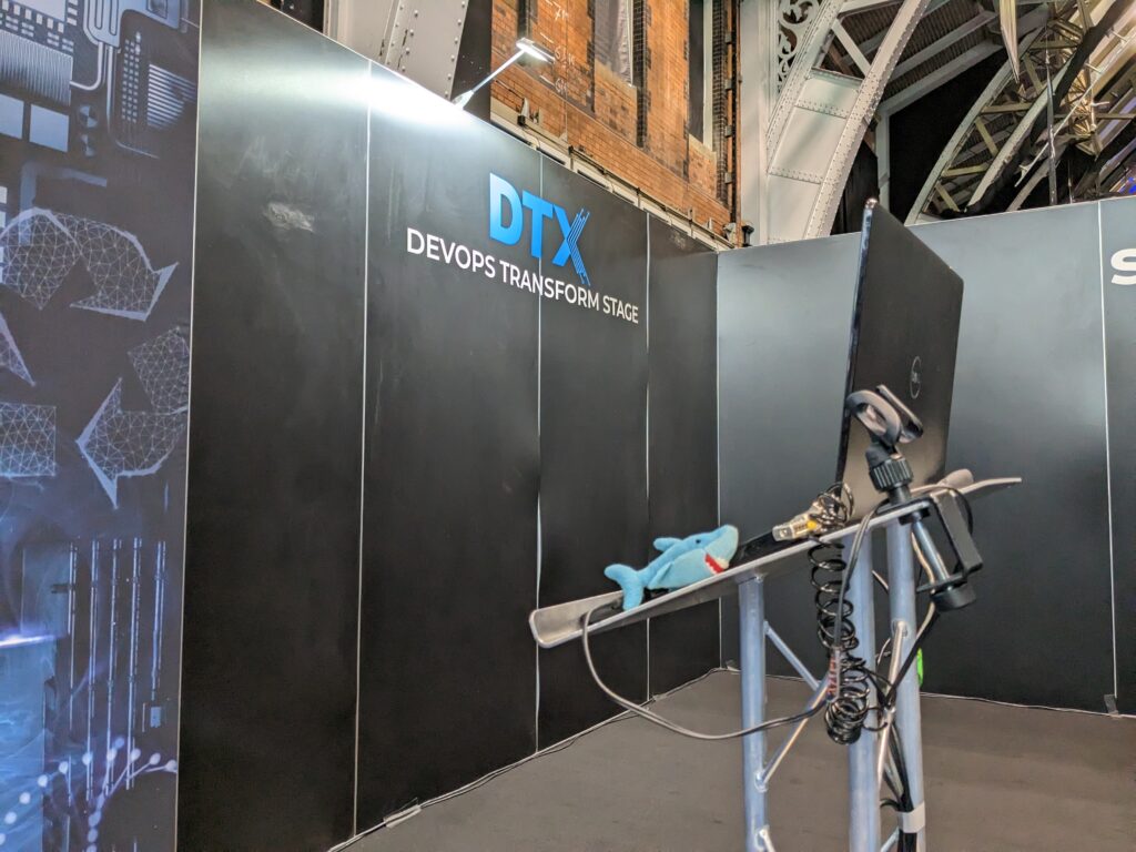
I also attended some events closer to home: May’s DTX Manchester and October’s Data Relay Manchester.

PXL 20230517 142206077

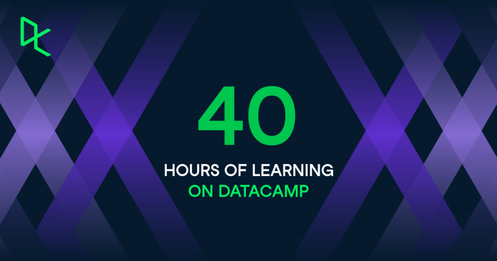
Separately, I used my DataCamp subscription to improve my Data Engineering skills. Their Data Engineer track has several great Python courses and helped me benchmark my T-SQL skills. Their Object-Oriented Programming in Python and Writing Functions in Python courses also helped me plug some work-related gaps.

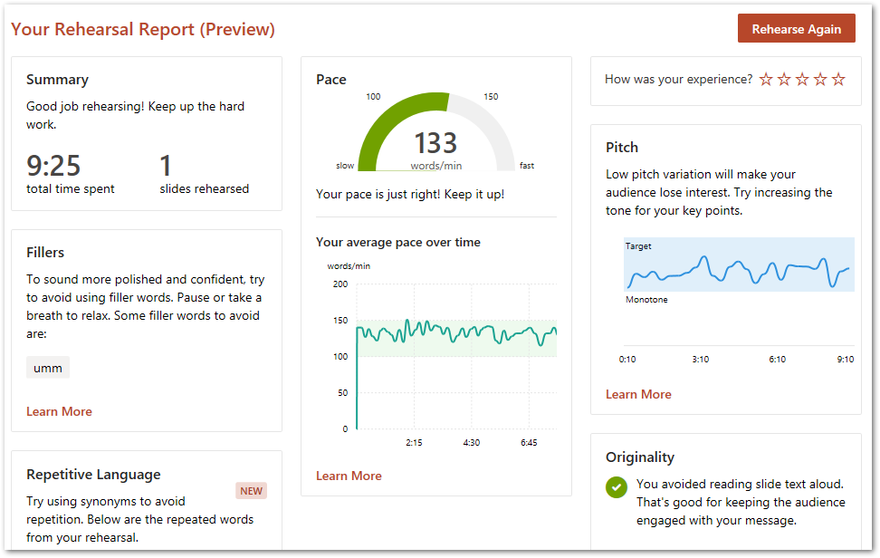
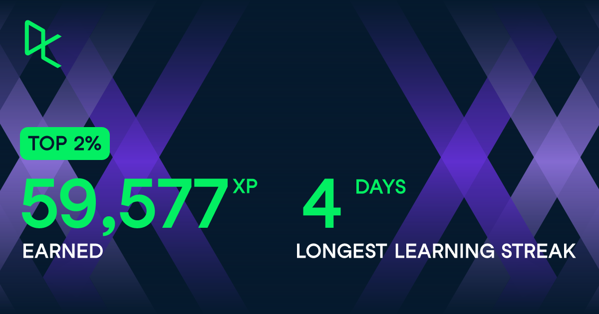
Helpfully, DataCamp has a new My Year In Data feature that summarises the 17 courses I completed this year:

DataCamp HoursLearning
DataCamp XPDayStreak

Finally, I also recertified my AWS SysOps Administrator certification in October using the now-traditional duo of Stephane Maarek and Tutorials Dojo. This certification validates my experience in deploying, managing, and operating workloads on AWS and puts me in a good position for my 2024 goals.

AWSSysOpsBadge

Collaborating & Communicating

This goal was focused on finding my voice and improving my work quality. I wanted to strengthen my contributions and increase my value.

A big part of this was making sure that I understood the languages and terms being used around me. My ultimate aim was to use and apply these terms correctly and appropriately. 2023 was the year I became familiar with data and programming terms including:

I also signed up for some Data Engineering-focused feeds to improve my industry knowledge. Examples include the Data Engineering Weekly and Seattle Data Guy newsletters, and the Advancing Analytics and nullQueries YouTube channels.

Collaboration-wise, I also hosted my first T-SQL Tuesday this year. It was great to work with Steve Jones, and I get to include myself on a pretty illustrious list of industry professionals now!

Finally, I also made it to my first User Group meeting! While I only made it to one event this year, I overcame a lot of personal anxiety there and look forward to exploring my local user groups more in 2024.

Knowledge Sharing & Presenting

This goal was focused on creating value. I wanted to improve my presentation skills, and find real-world applications for the knowledge gained from my posts and certifications.

It’s time to discuss New Stars of Data!

Bicuit & Terrabyte on a New Stars Of Data T-shirt

Upon viewing the event’s Call For Speakers, I saw a great chance to work on this goal. I’d already started writing a VSCode Data Wrangler post at the time (which ultimately became the New Stars Of Data Retrospective post) and quickly realised the post would lend itself very well to the requested abstract.

When creating the session, the combination of a sport I enjoy, data and code I’m familiar with and an impressive VSCode extension resulted in a smooth journey from storyboarding to delivery. The session was a pleasure to create and deliver, and was exactly the presenting introduction I was after!

I also wrote a blog series while creating the session, both as something to look back on and to potentially help future speakers.

2024 Goals

In this section, I use YearCompass to decide on my 2024 professional goals. For each goal, I’ll write a user story and then explain my reasoning.

Build Technology Projects

As a cloud enthusiast, I want to complete valuable project builds so that I can develop and validate my knowledge and skills, and have subject matter for future session abstracts.

It’s fair to say that 2023 has been a year of learning, with sources including:

All of which have given me ideas for things I can build! Some completely new things. Some things that have been gaining steam for a while. Other things that recent innovations have put within reach.

My first YearCompass 2024 goal is to start building them! As well as testing my skills and validating my knowledge, some of these projects would probably lend themselves to a session abstract or two!

Additionally, I’m considering studying towards an AWS Professional certification in 2025. So if I decide to go ahead with that, building a bunch of stuff would be well worth the effort and investment!

Finally, although I’ve gotten better at finishing projects since starting amazonwebshark there’s always room for improvement. This No Boilerplate video about The Cult Of Done Manifesto really resonated with me upon first watch, and I’ll be benchmarking my 2024 projects against it.

Build My Personal Brand

As an IT professional I want to build my personal brand so that I improve my soft skills and define my public image.

Continuing the build theme, my second YearCompass 2024 goal is focused on my soft skills and visibility.

I’ve spoken about confidence and anxiety previously. I will always be working on this, but it isn’t something I want to hide behind. As my contributions to this site and the wider community grow, I need to consider how those contributions influence the projected image of my personality, skills, experience, and behaviour.

Furthermore, in an age where AI tools and models are getting increasingly adept at a range of tasks, practising and demonstrating my soft skills is perhaps more important than ever. As technology becomes increasingly democratised, it is no longer enough to focus on technical skills alone.

I’ve already begun to establish my personal brand via amazonwebshark and social media. With my 2024 goals likely to put me in front of more fresh faces for the first time, now is definitely the time to make my personal brand a primary focus.

Build A Second Brain

As just a normal man I want to build a second brain so that I can organise my resources and work more efficiently.

For my final YearCompass 2024 goal, I want to take steps to solve a long-standing problem.

I have lots of stuff. Books, files, hyperlinks, videos…STUFF. Useful stuff, but unorganised and unstructured stuff. I also have lots of ideas. Ideas for efficiency and growth. Ideas for reliability and resilience. And I have various ways of capturing these ideas depending on where I happen to be. Even my car has a notepad.

Finally, and perhaps most importantly, I have several partially-enacted systems for handling all of this. Some systems turned out to be unfit for purpose. Some were overwhelmed, while others became unwieldy.

Recently, I’ve made efforts to organise and define everything. I’m already finding success with this, and with the recent discovery of the Second Brain and CODE methodologies I now have a framework to utilise. A well-built second brain will help organise my backlog, assist my day-to-day and support my future goals.

Summary

In this post, I used the free YearCompass booklet to reflect on 2023 and to plan some professional goals for 2024.

Having finished this post, I’m happy with my 2024 goals and am looking forward to seeing where the year takes me! I’ll post updates here and via my social, project and session links, which are available via the button below:

SharkLinkButton 1

Thanks for reading ~~^~~

Categories
Training & Community

New Stars Of Data Retrospective

I’m a speaker now! In this post, I write a retrospective review of my New Stars Of Data 6 session and overall experience.

Table of Contents

Introduction

In July, I shared the news that I was speaking at the October 2023 New Stars Of Data event:

2023 08 11 NewStarsOfDataSchedule

In August and October, I wrote about my preparations and experiences leading up to the event. Since then, the big day has come and gone!

With New Stars Of Data 6 now in the history books, I wanted to write a final retrospective post for my series. Firstly, I’ll examine both the Sale Sizzler data and VS Code Data Wrangler as a companion post for the session. Then I’ll sum up how the final week of preparation went and draw the series to a close.

Separately, my mentor Olivier Van Steenlandt has written about his mentoring experience on his blog. Give it a read!

Sale Sizzlers

This section of my New Stars Of Data retrospective explains what the Sale Sizzlers are and examines the data generated by a typical event.

Sale Sizzler Events

The Sale Sizzlers are a 5k road race series organised by my running club – Sale Harriers Manchester. Every Summer, four events take place at Wythenshawe Park in two-week intervals. The course is regarded as one of the fastest in North West England and attracts a wide range of participants from first-time racers to former Olympians.

SaleSizzler5KRoute

They began in the same year as the 2002 Commonwealth Games (also held in Manchester). Since then, thousands of runners have participated in the name of enjoyment, charity and personal bests.

Sale Sizzler Data

Sale Sizzler administration has changed over the years in response to both popularity and technology. Initially, everything was paper-based from entries to results. Then, as the Internet became more established, some processes moved online.

Today, everything from runner entry to results distribution can be completely outsourced to third parties. Since 2016, Nifty Entries have handled Sale Sizzlers administration and published the results as CSVs on their platform. Nifty’s Sale Sizzler data privacy policy is available here.

I used the 2023 Sale Sizzler 1’s CSV for my demo. As of 2023, these CSVs contain the following columns:

PositionINTRunner’s overall finishing position.
Finish TimeTIMETime from race start to runner crossing finish line.
NumberINTRunner’s race number.
First NameSTRINGRunner’s first name
Last NameSTRINGRunner’s last name.
Chip TimeTIMETime from runner crossing start line to runner crossing finish line.
ClubSTRINGRunner’s running club (if applicable)
Club PositionINTRunner’s finishing position relative to their running club.
GenderSTRINGRunner’s gender.
Gender PositionINTRunner’s finishing position relative to their gender.
CategorySTRINGRunner’s age group.
Category PositionINTRunner’s finishing position relative to their age group.

That’s all the required knowledge for the Sizzlers. Now let’s examine the catalyst for my session – Data Wrangler.

VS Code Data Wrangler

This section of my New Stars Of Data retrospective examines VS Code Data Wrangler’s features and the operations I used in my session demo.

Data Wrangler Features

The Data Wrangler Extension for Visual Studio Code was launched in March 2023. It is designed to help with data preparation, cleaning, and presentation, and has a library of built-in transformations and visualizations.

It offers features for quickly identifying and fixing errors, inconsistencies, and missing data. Data profiling, quality checks and formatting operations are also available.

Data Wrangler uses a no-code interface, and generates Python code behind the scenes using the pandas and regex open-source libraries. Transformations can be exported as Jupyter Notebooks, Python scripts and CSVs.

Data Wrangler Documentation

The Data Wrangler GitHub repo has excellent documentation. I’m not going to reproduce it here, because:

  • The repo deserves the traffic.
  • Data Wrangler is constantly being updated so the instructions can easily change.
  • The Readme is very well written and needs no improvement.

I will, however, highlight the following key areas:

The rest of this section examines the Data Wrangler operations I used in my demo.

Missing Value Operations

The first two operations in my demo removed the dataset’s 1123 missing values by:

  • Dropping missing Position values
  • Filling missing Club values

Most of the missing values belonged to runners who either didn’t start the race or didn’t finish it. These people had no finish time, which is a vital metric in my session and necessitated their removal from the dataset.

Removing these runners left 45 missing values in the Club column. These were runners unaffiliated to a running club. The fix this time was to replace empty values with Unaffiliated, leaving no missing values at all.

The Data Wrangler GUI uses Git-like representation for the Fill Missing Values operation, where the red column is before the change and green is after:

2023 06 03 ClubMissingValueAfter

Wrangler generated this Python code to update the Club column:

# Replace missing values with "Unaffiliated" in column: 'Club'
df = df.fillna({'Club': "Unaffiliated"})

Column Creation Operations

Next, I wanted to create some columns using the New Column By Example operation. Firstly, Data Wrangler requests target columns and a creation pattern. Microsoft Flash Fill then automatically creates a column when a pattern is detected from the columns chosen.

I created two new columns by:

  • Combining First Name and Last Name to make Full Name.
  • Combining Gender and Category to make Gender Category.

Both these columns simplify reporting. The Full Name column is easier to read than the separate First and Last Name columns, and brings the Nifty data in line with other data producers like Run Britain. Additionally, using the Full Name column in Power BI tables takes less space than using both of its parent columns.

Having a Gender Category column is not only for quality of life, but also for clarity. Most of the Category values like U20 and V50 don’t reveal the runner’s gender. Conversely, Gender Category values like Female U20 and Male V50 are obvious, unambiguous and better than Category values alone.

This GIF from the demo shows how the Gender Category column is created:

NewColumnExample1

During this, Data Wrangler generated this Python code:

# Derive column 'Gender Category' from columns: 'Gender', 'Category'
# Transform based on the following examples:
#    Category    Gender    Output
# 1: "Under 20"  "Male" => "Male Under 20"
df.insert(12, "Gender Category", df["Gender"] + " " + df["Category"])

This works, but produces a slight issue with the Senior Female and Senior Male values. In the case of Senior Male, Flash Fill outputs the new value of Male Senior Male (20-39).

This is correct, but the Male duplication is undesirable. This is resolved by identifying an instance of this value and removing the second Male string:

NewColumnExample2

This updates the Python code to:

# Derive column 'Gender Category' from columns: 'Gender', 'Category'
# Transform based on the following examples:
#    Category               Gender    Output
# 1: "Under 20"             "Male" => "Male Under 20"
# 2: "Senior Male (20-39)"  "Male" => "Male Senior (20-39)"
df.insert(12, "Gender Category", df.apply(lambda row : row["Gender"] + " " + row["Category"].split(" ")[0] + row["Category"][row["Category"].rfind(" "):], axis=1))

And the replacement values for both genders become Female Senior (20-34) and Male Senior (20-39).

Bespoke Operations

Finally, I wanted to demonstrate how to use bespoke Python code within Data Wrangler. My first operation was to add a column identifying the event:

df['Event'] = 'Sale Sizzler 1' 

This creates an Event column containing Sale Sizzler 1 in each row.

My second was a little more involved. The Sale Sizzler finish times are represented as HH:MM:SS. Power BI can show these values as strings but can’t use them for calculations. A better option was to transform them to total seconds, because as integers they are far more versatile.

This transformation can be done in DAX, but every dataset refresh would recalculate the values. This is unnecessarily computationally expensive. As the finish times will never change, it makes sense to apply Roche’s Maxim of Data Transformation and transform them upstream of Power BI using Data Wrangler.

This avoids Power BI having to do unnecessary repeat work, and indeed removes the need for Power BI to calculate the values at all! This also allows both the data model and the visuals using the transformed data to load faster.

Here is my custom Python code:

df['Chip Time Seconds'] = df['Chip time'].apply(lambda x: int(x.split(':')[0])*3600+ int(x.split(':')[1])*60 +int(x.split(':')[2])) 

This uses the split method and a lambda function to apply the following steps to each Chip Time value to calculate an equivalent Chip Time Seconds value:

  • Hours to seconds: capture the first number and multiply it by 3600.
  • Minutes to seconds: capture the second number and multiply it by 60.
  • Seconds: capture the third number.
  • Add all values together

So with the example of a Chip Time value of 00:15:11:

  • 00 * 3600 = 0 seconds
  • 15 * 60 = 900 seconds
  • 11 seconds
  • 0 + 900 + 11 = 911 Chip Time Seconds

These integers can then be used to calculate averages, high performers and key influencers. The full demo is in the session recording that is included further down this post.

Session

This section of my New Stars Of Data retrospective is about my final preparations and the day itself.

Final Week

Before my final meeting with Olivier, he asked me to think about my plans both for the week of the event and the day itself. This was surprisingly hard! I’d spent so much time on the build-up that I hadn’t even considered this.

The final meetup was divided into taking stock of the journey to get to event week, and some final discussion over event expectations and etiquette. New Stars Of Data uses Microsoft Teams for delivery, which I have lots of experience with through work. Olivier made sure I knew when to turn up and what to do.

Following some thought and input from Olivier, I did my final rehearsals at the start of the week and did a final run-through on Wednesday. After that, I took Olivier’s advice and gave myself time to mentally prepare for the big day.

The Big Day!

I spent Friday morning doing house and garden jobs. Basically staying as far away from the laptop as possible to keep my anxiety low. At noon I sprung into action, setting up my streaming devices, checking my demos worked and confirming I could access the Teams channel. Then I walked Wolfie to tire him out before my session. It turned out that Wolfie had other ideas!

New Stars Of Data has fifteen-minute windows between sessions for speaker transitions, and during this I chatted with the moderators who helped me stay calm. Wolfie stayed quiet during the whole time, then started barking two minutes in. Thankfully, I’d practised handling distractions!

The session felt like it flew by, and the demos went mostly as planned. One of the New Column By Example transformations in the Data Wrangler demo didn’t work as expected, erroring instead of giving the desired values.

This had happened during rehearsals, so I was prepared for the possibility of it failing again. To this end, I pre-recorded a successful transformation and stored the Python code generated by the operation. I wasn’t able to show the recording due to time constraints, but used the Python code to show what the expected output should have been.

My session was recorded and is on the DataGrillen YouTube channel:

I uploaded my session files to my Community-Sessions GitHub repo. If that naming schema sounds ambitious, well…

Future Plans

So, having presented my first session, what next?

Well, I had always planned to take my foot off the gas a little after completing New Stars Of Data to appreciate the experience (and write this retrospective!). I’ve been working on it since June, and I wanted to have some time for consideration and reflection.

With respect to Racing Towards Insights, I have a couple of optimisations I’m considering. These include using a virtual machine for the Power BI demos to take the pressure off my laptop, examining options for a thirty-minute version of the session for other events and looking at applications for the Python code export function.

I’m also keen to find out how to avoid the New Column By Example error I experienced. To this end, I’ve raised an issue on the Data Wrangler GitHub repo and will see if I can narrow down the problem.

Additionally, I’ve had several positive conversations with people about submitting sessions for local user groups and community events, and have several ideas for blog topics and personal projects that could lend themselves to session abstracts. With the knowledge gained from Olivier’s mentorship, I can now start to think about what these abstracts might look like.

Summary

In this post, I wrote a retrospective review of my New Stars Of Data 6 session and overall experience. In closing, I’d like to thank the following community members for being part of my New Stars Of Data journey:

If this post has been useful, the button below has links for contact, socials, projects and sessions:

SharkLinkButton 1

Thanks for reading ~~^~~

Categories
Training & Community

New Stars Of Data 6 Final Preparations

In this post, I talk about my final preparations for the upcoming New Stars Of Data 6 event in October 2023.

Table of Contents

Introduction

In July, I shared the news that I’m speaking at the next New Stars Of Data event in October:

2023 08 11 NewStarsOfDataSchedule

Last month I talked about how the slides were coming along, and about getting my presentation setup ready. So what have I been up to since?

Presentation Slides

In this section, I talk about the presentation slides for my session.

Content

The presentation has been mostly finished since the start of October. My mentor Olivier Van Steenlandt suggested that I commit to this deadline early in the process, and now I see why – it makes practising far easier! I’m still making minor tweaks based on delivery observations and feedback, but the slides now have the required content in the desired order.

I’ve also included some Unsplash images and personal photos in the deck. These images simplify and enhance the message of the slides they’re on, and inject some variety into the session.

Style

After some thought, I decided to add a slide theme to the deck. It was fine without one, but I felt the right theme would add some extra polish. So I duplicated the presentation and experimented with PowerPoint’s default themes.

I eventually decided on the Facet theme with the Office colour palette. It was easily the best fit of the default themes, with good colour and white space balance. I could have reviewed others online or made my own, but as the theme is basically an optional extra I didn’t want to put more time into the decision than was necessary.

So my presentation has gone from this:

2023 10 18 OpenSlideBasic

To this:

2023 10 18 OpenSlideTheme

I’m really happy with how it turned out!

Demo Material

In this section, I’ll talk about my session’s demos.

Demos form a big part of my session. I have two: a Data Wrangler demo showing several data transformations, and a Power BI demo showing visuals and insights generated from the wrangled data.

Data Wrangler Demo

The Data Wrangler is a great tool, and I want my demo to show it both in the best possible light, and in the context of an actual use case. So I spent time with the wrangler’s documentation and sample content to find the best transformations for my session.

Next, I considered how I’d transform the data in my day job and what I wanted to report against in Power BI. This quickly established an order of operations, governed by complexity (some transformations are simpler than others) and dependence (some transformations rely on others).

Finally, I drew up a rough end-to-end process and began to practise. The limited selection of transformations keeps the demo focused and streamlined, and knowing the order of operations helps my fluency and delivery.

Power BI Demo

For the Power BI demo, I considered what insights a race director would be most interested in that they couldn’t get from the CSV data alone. This led me towards visuals that would analyse the entire Sizzler series, like the Key Influencers and Distribution Tree visuals.

Next, I built some visuals and reviewed them in terms of how helpful they were, and how complex they were to explain. Complex visuals run the risk of alienating some viewers, which I would prefer to avoid!

Having selected my visuals, I tuned their filters and data fields to add value. For example, knowing that a 70-year-old male is faster than an under-18-year-old male isn’t valuable, but comparing the fastest speeds of all 70-year-old males across the series is!

Finally, I looked for links between the visuals and wrote practise notes based on them. For example, discussing the fastest times for each race leads into the key influencers for decreased chip times. In practice, this helps me tell a story with the data and provides a clear narrative for the demo.

Demo Resilience

There are always risks with live demos. Maybe an update will change the way a process runs. Perhaps a breaking change will stop a feature from working entirely. The program might not even load at all! So what’s the best way of managing those risks when presenting to a live audience?

I have a few aces up my sleeve just in case. Some suggested by Olivier; others off my own back:

  • Each Sizzler event has a pre-wrangled CSV. This protects against wrangler bugs and avoids repetition in the session.
  • I recorded a silent demo of the wrangler in case the entire extension won’t load.
  • All related files are stored on OneDrive in case my laptop dies.
  • A laptop change freeze will be applied on the week of the event. Updates for Windows, Ubuntu, VS Code and Power BI will not be applied.

Session Practise

In this section, I talk about perhaps the most important part of my final preparations for New Stars Of Data – practising my session!

Pre Flight

To get my brain used to the tension of waiting for 15:45 on October 27, I use my phone’s timer to count me into a rehearsal. Olivier made a point of practising this with me, and it definitely helps to create the environment I’ll be in on the day!

I’m also the proud owner of a cheap ring light, which has indirectly become my clapperboard. When my face is lit, the camera is rolling! While my Logitech Streamcam has a live light, it’s a bit tiny and it can’t compete with my Hollywood lights and director:

Ringlight500

Rehearsal

I’m using PowerPoint’s Speaker Coach. It monitors aspects like filler words and slide repetition, and measures pacing and cadence. Speaker Coach offers feedback both during and after a practice session, generating a report with insights and recommendations:

2023 10 18 PresenterCoachSummary

Microsoft has documented Speaker Coach’s suggestions and the research used to determine them, such as:

Based on field study and past academic research, Speaker Coach recommends that presenters speak at a rate of 100 to 165 words per minute; this is the rate at which most audiences we’ve tested find it easiest to process the information they hear.

I’ve also had regular meetings with Olivier to run through the presentation in person. Not all of these went well! But this was the idea. Make mistakes. Loads of mistakes! Because then there’s less chance of them happening on the day!

I was also fortunate enough to get some advice from Redgate Product Advocate Grant Fritchey at October’s Data Relay event. The changes I’ve made to my notes based on his suggestions have been very helpful. Thanks, Grant!

Summary

In this post, I talked about my final preparations for the upcoming New Stars Of Data 6 event in October 2023.

This will be my final post before the event! I’m presenting my Racing Towards Insights session online on October 27 at 15:45. The track links are currently on the New Stars Of Data schedule!

If this post has been useful, please feel free to follow me on the following platforms for future updates:

Thanks for reading ~~^~~